編輯:關於Android編程
使用SlidingTabLayout需要准備2個類,分別是 SlidingTabLayout,與SlidingTabStrip,,放進項目中時只用修改下包名即可。

效果制作的不是很好。
這篇文章,也是在網上搜了很多資源參考,對 SlidingTabLayout.java和SlidingTabStrip.java進行了修改。大家可以更改他的格式字體大小、選中狀態,分割線調整等等。先上傳這兩個文件,改動支出都做了注釋。
SlidingTabLayout.java
/*
 * Copyright (C) 2013 The Android Open Source Project
 *
 * Licensed under the Apache License, Version 2.0 (the "License");
 * you may not use this file except in compliance with the License.
 * You may obtain a copy of the License at
 *
 *      http://www.apache.org/licenses/LICENSE-2.0
 *
 * Unless required by applicable law or agreed to in writing, software
 * distributed under the License is distributed on an "AS IS" BASIS,
 * WITHOUT WARRANTIES OR CONDITIONS OF ANY KIND, either express or implied.
 * See the License for the specific language governing permissions and
 * limitations under the License.
 */

package com.example.my.slidingtablayout;

import android.R;
import android.content.Context;
import android.graphics.Canvas;
import android.graphics.Color;
import android.graphics.Paint;
import android.util.AttributeSet;
import android.util.TypedValue;
import android.view.View;
import android.widget.LinearLayout;

class SlidingTabStrip extends LinearLayout {

    private static final int DEFAULT_BOTTOM_BORDER_THICKNESS_DIPS = 0;  //去除陰影
    private static final byte DEFAULT_BOTTOM_BORDER_COLOR_ALPHA = 0x26;
    private static final int SELECTED_INDICATOR_THICKNESS_DIPS = 4;     //設置滾動條的高度
    private static final int DEFAULT_SELECTED_INDICATOR_COLOR = 0xFF33B5E5;


    private static final int DEFAULT_DIVIDER_THICKNESS_DIPS = 1;
    private static final byte DEFAULT_DIVIDER_COLOR_ALPHA = 0x20;
    private static final float DEFAULT_DIVIDER_HEIGHT = 0.5f;

    private final int mBottomBorderThickness;
    private final Paint mBottomBorderPaint;

    private final int mSelectedIndicatorThickness;
    private final Paint mSelectedIndicatorPaint;

    private final int mDefaultBottomBorderColor;

    private final Paint mDividerPaint;
    private final float mDividerHeight;

    private int mSelectedPosition;
    private float mSelectionOffset;

    private SlidingTabLayout.TabColorizer mCustomTabColorizer;
    private final SimpleTabColorizer mDefaultTabColorizer;

    SlidingTabStrip(Context context) {
        this(context, null);
    }

    SlidingTabStrip(Context context, AttributeSet attrs) {
        super(context, attrs);
        setWillNotDraw(false);

        final float density = getResources().getDisplayMetrics().density;

        TypedValue outValue = new TypedValue();
        context.getTheme().resolveAttribute(R.attr.colorForeground, outValue, true);
        final int themeForegroundColor = outValue.data;

        mDefaultBottomBorderColor = setColorAlpha(themeForegroundColor,
                DEFAULT_BOTTOM_BORDER_COLOR_ALPHA);

        mDefaultTabColorizer = new SimpleTabColorizer();
        mDefaultTabColorizer.setIndicatorColors(DEFAULT_SELECTED_INDICATOR_COLOR);
        mDefaultTabColorizer.setDividerColors(setColorAlpha(themeForegroundColor,
                DEFAULT_DIVIDER_COLOR_ALPHA));

        mBottomBorderThickness = (int) (DEFAULT_BOTTOM_BORDER_THICKNESS_DIPS * density);
        mBottomBorderPaint = new Paint();
        mBottomBorderPaint.setColor(mDefaultBottomBorderColor);

        mSelectedIndicatorThickness = (int) (SELECTED_INDICATOR_THICKNESS_DIPS * density);
        mSelectedIndicatorPaint = new Paint();

        mDividerHeight = DEFAULT_DIVIDER_HEIGHT;
        mDividerPaint = new Paint();
        mDividerPaint.setStrokeWidth((int) (DEFAULT_DIVIDER_THICKNESS_DIPS * density));
    }

    void setCustomTabColorizer(SlidingTabLayout.TabColorizer customTabColorizer) {
        mCustomTabColorizer = customTabColorizer;
        invalidate();
    }

    void setSelectedIndicatorColors(int... colors) {
        // Make sure that the custom colorizer is removed
        mCustomTabColorizer = null;
        mDefaultTabColorizer.setIndicatorColors(colors);
        invalidate();
    }

    void setDividerColors(int... colors) {
        // Make sure that the custom colorizer is removed
        mCustomTabColorizer = null;
        mDefaultTabColorizer.setDividerColors(colors);
        invalidate();
    }

    void onViewPagerPageChanged(int position, float positionOffset) {
        mSelectedPosition = position;
        mSelectionOffset = positionOffset;
        invalidate();
    }

    @Override
    protected void onDraw(Canvas canvas) {
        final int height = getHeight();
        final int childCount = getChildCount();
        final int dividerHeightPx = (int) (Math.min(Math.max(0f, mDividerHeight), 1f) * height);
        final SlidingTabLayout.TabColorizer tabColorizer = mCustomTabColorizer != null
                ? mCustomTabColorizer
                : mDefaultTabColorizer;

        // Thick colored underline below the current selection
        if (childCount > 0) {
            View selectedTitle = getChildAt(mSelectedPosition);
            int left = selectedTitle.getLeft();
            int right = selectedTitle.getRight();
            int color = tabColorizer.getIndicatorColor(mSelectedPosition);

            if (mSelectionOffset > 0f && mSelectedPosition < (getChildCount() - 1)) {
                int nextColor = tabColorizer.getIndicatorColor(mSelectedPosition + 1);
                if (color != nextColor) {
                    color = blendColors(nextColor, color, mSelectionOffset);
                }

                // Draw the selection partway between the tabs
                View nextTitle = getChildAt(mSelectedPosition + 1);
                left = (int) (mSelectionOffset * nextTitle.getLeft() +
                        (1.0f - mSelectionOffset) * left);
                right = (int) (mSelectionOffset * nextTitle.getRight() +
                        (1.0f - mSelectionOffset) * right);
            }

            mSelectedIndicatorPaint.setColor(color);

            canvas.drawRect(left, height - mSelectedIndicatorThickness, right,
                    height, mSelectedIndicatorPaint);
        }

        // Thin underline along the entire bottom edge
        canvas.drawRect(0, height - mBottomBorderThickness, getWidth(), height, mBottomBorderPaint);

        // Vertical separators between the titles
        int separatorTop = (height - dividerHeightPx) / 2;
        for (int i = 0; i < childCount - 1; i++) {
            View child = getChildAt(i);
            mDividerPaint.setColor(tabColorizer.getDividerColor(i));
            canvas.drawLine(child.getRight(), separatorTop, child.getRight(),
                    separatorTop + dividerHeightPx, mDividerPaint);
        }
    }

    /**
     * Set the alpha value of the {@code color} to be the given {@code alpha} value.
     */
    private static int setColorAlpha(int color, byte alpha) {
        return Color.argb(alpha, Color.red(color), Color.green(color), Color.blue(color));
    }

    /**
     * Blend {@code color1} and {@code color2} using the given ratio.
     *
     * @param ratio of which to blend. 1.0 will return {@code color1}, 0.5 will give an even blend,
     *              0.0 will return {@code color2}.
     */
    private static int blendColors(int color1, int color2, float ratio) {
        final float inverseRation = 1f - ratio;
        float r = (Color.red(color1) * ratio) + (Color.red(color2) * inverseRation);
        float g = (Color.green(color1) * ratio) + (Color.green(color2) * inverseRation);
        float b = (Color.blue(color1) * ratio) + (Color.blue(color2) * inverseRation);
        return Color.rgb((int) r, (int) g, (int) b);
    }

    private static class SimpleTabColorizer implements SlidingTabLayout.TabColorizer {
        private int[] mIndicatorColors;    //
        private int[] mDividerColors;      //


        @Override
        public final int getIndicatorColor(int position) {
            return mIndicatorColors[position % mIndicatorColors.length];
        }

        @Override
        public final int getDividerColor(int position) {
            return mDividerColors[position % mDividerColors.length];
        }

        void setIndicatorColors(int... colors) {
            mIndicatorColors = colors;
        }

        void setDividerColors(int... colors) {
            mDividerColors = colors;
        }
    }
}
上邊因為使用了自定義的顏色,所以這裡要在attrs.xml聲明一下,不然找不到:
布局文件也要用到自定義:
最後一道就是在你的Activity運用這種開源:可以調整之處也做了說明
package com.example.my.slidingtablayout;

import android.graphics.Color;
import android.os.Bundle;
import android.support.v4.view.PagerAdapter;
import android.support.v4.view.ViewPager;
import android.support.v7.app.AppCompatActivity;
import android.view.View;
import android.view.ViewGroup;
import android.widget.LinearLayout;

import java.util.ArrayList;

public class MainActivity extends AppCompatActivity {
    //創建 顏色數組 用來做viewpager的背景
    @Override
    protected void onCreate(Bundle savedInstanceState) {
        super.onCreate(savedInstanceState);
        setContentView(R.layout.activity_main);
        ViewPager pager = (ViewPager) findViewById(R.id.view_pager);
        SlidingTabLayout tab = (SlidingTabLayout) findViewById(R.id.sliding);
        tab.setDividerColors(Color.TRANSPARENT); //設置標題的分割線
        tab.setSelectedIndicatorColors(Color.rgb(51, 181, 229)); //設置滾動條的顏色
        tab.setTitleSize(18);  //...設置字體的顏色,默認16

        MyAdapte adapter = new MyAdapte();
        pager.setAdapter(adapter);
        tab.setViewPager(pager);
    }

    int[] colors = {0xFF123456, 0xFF654321, 0xFF336699};

    class MyAdapte extends PagerAdapter {
        //可以考慮把這個數組添加到集合裡面
        String[] titles = {"AA", "BB", "CC"};


        ArrayList layouts = new ArrayList();

        MyAdapte() {

            for (int i = 0; i < 3; i++) {
                LinearLayout l = new LinearLayout(MainActivity.this);
                l.setBackgroundColor(colors[i]);
                l.setLayoutParams(new ViewGroup.LayoutParams(ViewGroup.LayoutParams.MATCH_PARENT, ViewGroup.LayoutParams.MATCH_PARENT));
                layouts.add(l);
            }

        }

        @Override
        public int getCount() {
            return layouts.size();
        }

        @Override
        public boolean isViewFromObject(View view, Object o) {
            return view == o;
        }

        @Override
        public Object instantiateItem(ViewGroup container, int position) {
            LinearLayout l = layouts.get(position);
            container.addView(l);
            return l;
        }

        @Override
        public void destroyItem(ViewGroup container, int position, Object object) {
            container.removeView(layouts.get(position));
        }

        @Override
        public CharSequence getPageTitle(int position) {
            //...可以返回集合list.get(position);
            return titles[position];
        }
    }
}
 android 仿小米icon處理,加陰影和邊框
本人自己在做一個launcher,所以需要處理icon,加陰影和邊框等。這只是一種處理方法,其他的處理方法類似。 效果圖: &
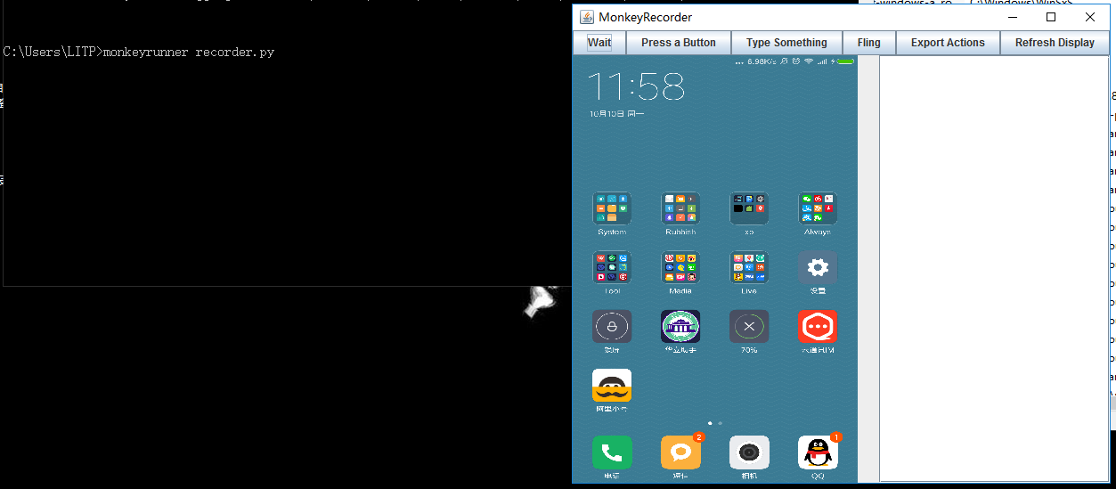 [Android 測試] 性能回歸測試之 MonkeyRunner使用、插件擴展、結合批處理
一、 MonkeyRunner簡介monkeyrunner也是一款安卓sdk自有的測試工具,開源,位於\sdk\tools下面,它主要做性能測試,回歸測試,並且可以自定義
 Android基礎入門教程——10.8 LayoutInflater(布局服務)
Android基礎入門教程——10.8 LayoutInflater(布局服務)標簽(空格分隔): Android基礎入門教程本節引言: 本節繼
 Android中常見Intent習慣用法-上篇(附源碼下載)
發送短信 發送短信的時候,我們要使用的action是Intent.ACTION_SENDTO,並且要指定其URI是smsto:協議,這樣能保證是短信應用接