編輯:關於Android編程
@RemoteView
public class Button extends TextView {
    public Button(Context context) {
        this(context, null);
    }

    public Button(Context context, AttributeSet attrs) {
        this(context, attrs, com.android.internal.R.attr.buttonStyle);
    }

    public Button(Context context, AttributeSet attrs, int defStyle) {
        super(context, attrs, defStyle);
    }

    @Override
    public void onInitializeAccessibilityEvent(AccessibilityEvent event) {
        super.onInitializeAccessibilityEvent(event);
        event.setClassName(Button. class.getName());
    }

    @Override
    public void onInitializeAccessibilityNodeInfo(AccessibilityNodeInfo info) {
        super.onInitializeAccessibilityNodeInfo(info);
        info.setClassName(Button. class.getName());
    }
}
是直接繼承於TextView,所不同的是在構造方法中添加了Button的樣式,並且在初始化可見性方面交由Button類自己來處理。雖然Button的實現比較簡單,但是它的子類並不是這樣。看一下: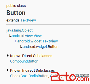
/** *先從構造方法開始,在構造方法中,* A button with two states, checked and unchecked. When the button is pressed * or clicked, the state changes automatically. *
* *XML attributes
** See {@link android.R.styleable#CompoundButton * CompoundButton Attributes}, {@link android.R.styleable#Button Button * Attributes}, {@link android.R.styleable#TextView TextView Attributes}, {@link * android.R.styleable #View View Attributes} *
*/ public abstract class CompoundButton extends Button implements Checkable { private boolean mChecked ; private int mButtonResource ; private boolean mBroadcasting ; private Drawable mButtonDrawable; private OnCheckedChangeListener mOnCheckedChangeListener; private OnCheckedChangeListener mOnCheckedChangeWidgetListener ; private static final int[] CHECKED_STATE_SET = { R.attr.state_checked }; public CompoundButton(Context context) { this(context, null); } public CompoundButton(Context context, AttributeSet attrs) { this(context, attrs, 0); } public CompoundButton(Context context, AttributeSet attrs, int defStyle) { super(context, attrs, defStyle); TypedArray a = context.obtainStyledAttributes( attrs, com.android.internal.R.styleable.CompoundButton, defStyle, 0); Drawable d = a.getDrawable(com.android.internal.R.styleable.CompoundButton_button); if (d != null ) { setButtonDrawable(d); } boolean checked = a .getBoolean(com.android.internal.R.styleable.CompoundButton_checked, false); setChecked(checked); a.recycle(); } public void toggle() { setChecked(! mChecked); } @Override public boolean performClick() { /* * XXX: These are tiny, need some surrounding 'expanded touch area', * which will need to be implemented in Button if we only override * performClick() */ /* When clicked, toggle the state */ toggle(); return super .performClick(); } @ViewDebug.ExportedProperty public boolean isChecked() { return mChecked ; } /** *Changes the checked state of this button.
* * @param checked true to check the button, false to uncheck it */ public void setChecked(boolean checked) { if (mChecked != checked) { mChecked = checked; refreshDrawableState(); notifyViewAccessibilityStateChangedIfNeeded( AccessibilityEvent.CONTENT_CHANGE_TYPE_UNDEFINED ); // Avoid infinite recursions if setChecked() is called from a listener if (mBroadcasting ) { return; } mBroadcasting = true ; if (mOnCheckedChangeListener != null) { mOnCheckedChangeListener.onCheckedChanged(this, mChecked); } if (mOnCheckedChangeWidgetListener != null) { mOnCheckedChangeWidgetListener .onCheckedChanged(this, mChecked); } mBroadcasting = false ; } } /** * Register a callback to be invoked when the checked state of this button * changes. * * @param listener the callback to call on checked state change */ public void setOnCheckedChangeListener(OnCheckedChangeListener listener) { mOnCheckedChangeListener = listener; } /** * Register a callback to be invoked when the checked state of this button * changes. This callback is used for internal purpose only. * * @param listener the callback to call on checked state change * @hide */ void setOnCheckedChangeWidgetListener(OnCheckedChangeListener listener) { mOnCheckedChangeWidgetListener = listener; } /** * Interface definition for a callback to be invoked when the checked state * of a compound button changed. */ public static interface OnCheckedChangeListener { /** * Called when the checked state of a compound button has changed. * * @param buttonView The compound button view whose state has changed. * @param isChecked The new checked state of buttonView. */ void onCheckedChanged(CompoundButton buttonView, boolean isChecked); } /** * Set the background to a given Drawable, identified by its resource id. * * @param resid the resource id of the drawable to use as the background */ public void setButtonDrawable(int resid) { if (resid != 0 && resid == mButtonResource ) { return; } mButtonResource = resid; Drawable d = null; if (mButtonResource != 0) { d = getResources().getDrawable(mButtonResource ); } setButtonDrawable(d); } /** * Set the background to a given Drawable * * @param d The Drawable to use as the background */ public void setButtonDrawable(Drawable d) { if (d != null ) { if (mButtonDrawable != null) { mButtonDrawable.setCallback(null); unscheduleDrawable( mButtonDrawable); } d.setCallback( this); d.setVisible(getVisibility() == VISIBLE, false); mButtonDrawable = d; setMinHeight(mButtonDrawable .getIntrinsicHeight()); } refreshDrawableState(); } @Override public void onInitializeAccessibilityEvent(AccessibilityEvent event) { super.onInitializeAccessibilityEvent(event); event.setClassName(CompoundButton.class .getName()); event.setChecked( mChecked); } @Override public void onInitializeAccessibilityNodeInfo(AccessibilityNodeInfo info) { super.onInitializeAccessibilityNodeInfo(info); info.setClassName(CompoundButton.class .getName()); info.setCheckable( true); info.setChecked( mChecked); } @Override public int getCompoundPaddingLeft() { int padding = super.getCompoundPaddingLeft(); if (!isLayoutRtl()) { final Drawable buttonDrawable = mButtonDrawable; if (buttonDrawable != null) { padding += buttonDrawable.getIntrinsicWidth(); } } return padding; } @Override public int getCompoundPaddingRight() { int padding = super.getCompoundPaddingRight(); if (isLayoutRtl()) { final Drawable buttonDrawable = mButtonDrawable; if (buttonDrawable != null) { padding += buttonDrawable.getIntrinsicWidth(); } } return padding; } /** * @hide */ @Override public int getHorizontalOffsetForDrawables() { final Drawable buttonDrawable = mButtonDrawable ; return (buttonDrawable != null) ? buttonDrawable.getIntrinsicWidth() : 0; } @Override protected void onDraw(Canvas canvas) { super.onDraw(canvas); final Drawable buttonDrawable = mButtonDrawable ; if (buttonDrawable != null) { final int verticalGravity = getGravity() & Gravity.VERTICAL_GRAVITY_MASK ; final int drawableHeight = buttonDrawable.getIntrinsicHeight(); final int drawableWidth = buttonDrawable.getIntrinsicWidth(); int top = 0; switch (verticalGravity) { case Gravity.BOTTOM : top = getHeight() - drawableHeight; break; case Gravity.CENTER_VERTICAL : top = (getHeight() - drawableHeight) / 2; break; } int bottom = top + drawableHeight; int left = isLayoutRtl() ? getWidth() - drawableWidth : 0; int right = isLayoutRtl() ? getWidth() : drawableWidth; buttonDrawable.setBounds(left, top, right, bottom); buttonDrawable.draw(canvas); } } @Override protected int[] onCreateDrawableState(int extraSpace) { final int [] drawableState = super.onCreateDrawableState(extraSpace + 1); if (isChecked()) { mergeDrawableStates(drawableState, CHECKED_STATE_SET); } return drawableState; } @Override protected void drawableStateChanged() { super.drawableStateChanged(); if (mButtonDrawable != null) { int[] myDrawableState = getDrawableState(); // Set the state of the Drawable mButtonDrawable.setState(myDrawableState); invalidate(); } } @Override protected boolean verifyDrawable(Drawable who) { return super .verifyDrawable(who) || who == mButtonDrawable; } @Override public void jumpDrawablesToCurrentState() { super.jumpDrawablesToCurrentState(); if (mButtonDrawable != null) mButtonDrawable.jumpToCurrentState(); } static class SavedState extends BaseSavedState { boolean checked ; /** * Constructor called from {@link CompoundButton#onSaveInstanceState()} */ SavedState(Parcelable superState) { super(superState); } /** * Constructor called from {@link #CREATOR} */ private SavedState(Parcel in) { super(in); checked = (Boolean)in.readValue( null); } @Override public void writeToParcel(Parcel out, int flags) { super.writeToParcel(out, flags); out.writeValue( checked); } @Override public String toString() { return "CompoundButton.SavedState{" + Integer.toHexString(System.identityHashCode(this)) + " checked=" + checked + "}" ; } public static final Parcelable.CreatorCREATOR = new Parcelable.Creator () { public SavedState createFromParcel(Parcel in) { return new SavedState(in); } public SavedState[] newArray(int size) { return new SavedState[size]; } }; } @Override public Parcelable onSaveInstanceState() { // Force our ancestor class to save its state setFreezesText( true); Parcelable superState = super.onSaveInstanceState(); SavedState ss = new SavedState(superState); ss. checked = isChecked(); return ss; } @Override public void onRestoreInstanceState(Parcelable state) { SavedState ss = (SavedState) state; super.onRestoreInstanceState(ss.getSuperState()); setChecked(ss. checked); requestLayout(); } }
 public CompoundButton(Context context, AttributeSet attrs, int defStyle) {
        super(context, attrs, defStyle);

        TypedArray a =
                context.obtainStyledAttributes(
                        attrs, com.android.internal.R.styleable.CompoundButton, defStyle, 0);

        Drawable d = a.getDrawable(com.android.internal.R.styleable.CompoundButton_button);
        if (d != null ) {
            setButtonDrawable(d);
        }

        boolean checked = a
                .getBoolean(com.android.internal.R.styleable.CompoundButton_checked, false);
        setChecked(checked);

        a.recycle();
    }
先是從attrs中讀取定義的屬性,一個是Drawable用於設置背景;一個是布爾類型變量用於判斷是否check過。設置背景使用的是setButtonDrawable()方法,代碼如下:/**
* Set the background to a given Drawable
*
* @param d The Drawable to use as the background
*/
public void setButtonDrawable(Drawable d) {
if (d != null ) {
if (mButtonDrawable != null) {
mButtonDrawable.setCallback(null);
unscheduleDrawable( mButtonDrawable);
}
d.setCallback( this);
d.setVisible(getVisibility() == VISIBLE, false);
mButtonDrawable = d;
setMinHeight(mButtonDrawable .getIntrinsicHeight());
}
refreshDrawableState();
}
這個方法寫的就比較完善,可以作為一個學習的典范。首先判斷傳遞過來的Drawable是否為空,如果不為空並且默認的Drawable也不為空,那麼取消默認Drawable的callback,然後調用unscheduleDrawable方法。這個方法代碼如下: /**
* Unschedule any events associated with the given Drawable. This can be
* used when selecting a new Drawable into a view, so that the previous
* one is completely unscheduled.
*
* @param who The Drawable to unschedule.
*
* @see #drawableStateChanged
*/
public void unscheduleDrawable(Drawable who) {
if (mAttachInfo != null && who != null) {
mAttachInfo.mViewRootImpl .mChoreographer.removeCallbacks(
Choreographer.CALLBACK_ANIMATION, null, who);
}
}
從方法注釋中可以看出它的用途,正是更換Drawable時候使用的。接下來開始重新設置Drawable,包括回調、可見性、最小高度。最後調用refreshDrawableState()方法,這個是View類的方法,用於更新Drawable狀態。 然後再回過頭看一下setChecked(checked)方法,這個用於設置check,也就是button的點擊狀態。代碼如下:/**
* Changes the checked state of this button.
*
* @param checked true to check the button, false to uncheck it
*/
public void setChecked( boolean checked) {
if (mChecked != checked) {
mChecked = checked;
refreshDrawableState();
notifyViewAccessibilityStateChangedIfNeeded(
AccessibilityEvent.CONTENT_CHANGE_TYPE_UNDEFINED );
// Avoid infinite recursions if setChecked() is called from a listener
if (mBroadcasting ) {
return;
}
mBroadcasting = true ;
if (mOnCheckedChangeListener != null) {
mOnCheckedChangeListener.onCheckedChanged(this, mChecked);
}
if (mOnCheckedChangeWidgetListener != null) {
mOnCheckedChangeWidgetListener .onCheckedChanged(this, mChecked);
}
mBroadcasting = false ;
}
}
在這個方法中多出了一個接口,這個接口真是check的一個回調接口,代碼如下:/**
* Interface definition for a callback to be invoked when the checked state
* of a compound button changed.
*/
public static interface OnCheckedChangeListener {
/**
* Called when the checked state of a compound button has changed.
*
* @param buttonView The compound button view whose state has changed.
* @param isChecked The new checked state of buttonView.
*/
void onCheckedChanged(CompoundButton buttonView, boolean isChecked);
} 這種回調接口在Android中處處可見,之前的文章也有介紹過。但是在上面的方法,它使用了一個mBroadcasting變量,進而巧妙地避免了重復遞歸的問題,大家自己感受一下。 然後就是ondraw()方法了,把之前的drawable畫出來。代碼如下: @Override
protected void onDraw(Canvas canvas) {
super.onDraw(canvas);
final Drawable buttonDrawable = mButtonDrawable ;
if (buttonDrawable != null) {
final int verticalGravity = getGravity() & Gravity.VERTICAL_GRAVITY_MASK ;
final int drawableHeight = buttonDrawable.getIntrinsicHeight();
final int drawableWidth = buttonDrawable.getIntrinsicWidth();
int top = 0;
switch (verticalGravity) {
case Gravity.BOTTOM :
top = getHeight() - drawableHeight;
break;
case Gravity.CENTER_VERTICAL :
top = (getHeight() - drawableHeight) / 2;
break;
}
int bottom = top + drawableHeight;
int left = isLayoutRtl() ? getWidth() - drawableWidth : 0;
int right = isLayoutRtl() ? getWidth() : drawableWidth;
buttonDrawable.setBounds(left, top, right, bottom);
buttonDrawable.draw(canvas);
}
}
看得出來,在onDrawable()方法中,最主要的部分還是如何確定上下左右四個參數。確定完後就可以畫出來了。但是,CompoundButton是一個抽象類,並不能直接使用,那看一下它的子類是如何實現的: public class CheckBox extends CompoundButton {
public CheckBox(Context context) {
this(context, null);
}
public CheckBox(Context context, AttributeSet attrs) {
this(context, attrs, com.android.internal.R.attr.checkboxStyle);
}
public CheckBox(Context context, AttributeSet attrs, int defStyle) {
super(context, attrs, defStyle);
}
@Override
public void onInitializeAccessibilityEvent(AccessibilityEvent event) {
super.onInitializeAccessibilityEvent(event);
event.setClassName(CheckBox. class.getName());
}
@Override
public void onInitializeAccessibilityNodeInfo(AccessibilityNodeInfo info) {
super.onInitializeAccessibilityNodeInfo(info);
info.setClassName(CheckBox. class.getName());
}
}
和Button的實現差不多,使用了一個自己的樣式。並且也是重寫了那兩個方法。再來看一下RadioButton,public class RadioButton extends CompoundButton {
public RadioButton(Context context) {
this(context, null);
}
public RadioButton(Context context, AttributeSet attrs) {
this(context, attrs, com.android.internal.R.attr.radioButtonStyle);
}
public RadioButton(Context context, AttributeSet attrs, int defStyle) {
super(context, attrs, defStyle);
}
/**
* {@inheritDoc}
*
* If the radio button is already checked, this method will not toggle the radio button.
*/
@Override
public void toggle() {
// we override to prevent toggle when the radio is already
// checked (as opposed to check boxes widgets)
if (!isChecked()) {
super.toggle();
}
}
@Override
public void onInitializeAccessibilityEvent(AccessibilityEvent event) {
super.onInitializeAccessibilityEvent(event);
event.setClassName(RadioButton. class.getName());
}
@Override
public void onInitializeAccessibilityNodeInfo(AccessibilityNodeInfo info) {
super.onInitializeAccessibilityNodeInfo(info);
info.setClassName(RadioButton. class.getName());
}
}
和CheckBox實現差不多,區別在於多重寫了一個方法,用於防止按鈕被重復點擊。另外還有ToggleButton以及Switch,前者實現也比較簡單,後者稍微麻煩了一些,感興趣可以自己分析。 最後切入正題,看看滑動Button要如何實現呢?首先看一下效果圖: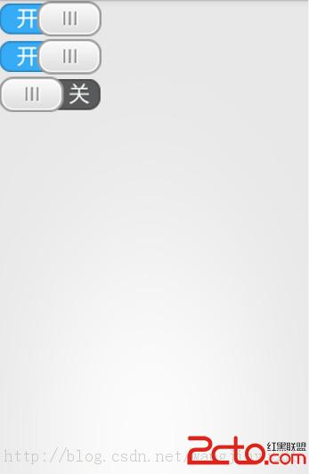 圖1-1
圖1-1 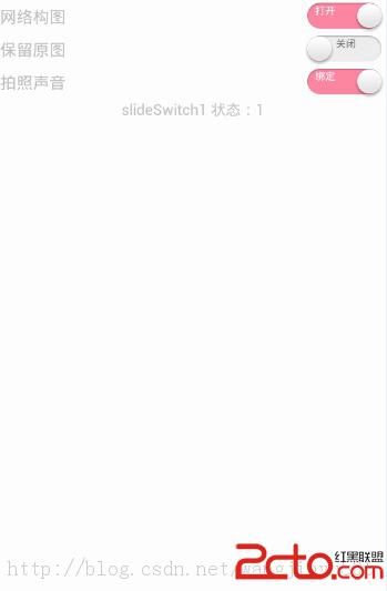 圖1-2 圖1-1所示的滑動Button實現的思路是這樣的,背景圖片有開和關的文字,一個按鈕在其上面左右滑動,遮住相應的部分,使其在一個位置時候只能看到一個開關。
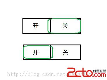

 2、背景圖片
 編碼: 在自定義滑動按鈕控件的時候,可以有多種選擇,可以繼承於Button,也可以繼承於Button的子類,也可以繼承於View類等。我們知道滑動按鈕是一個很簡單的控件,就是左右滑動改變顯示內容,不需要其他的額外東西在裡面,所以直接繼承於View來實現即可。如果繼承於系統的一些控件,那麼有很多東西用不到,會造成浪費。 1、定義一個類繼承於View,初始化構造方法,在構造方法中加載圖片及其信息。 2、重寫onMeasure()方法,計算控件的大小。 3、重寫onTouchEvent()方法,對滑動事件進行判別處理。 4、定義接口,實現回調。 5、重寫onDraw()方法,動態畫出按鈕。代碼如下:
/**
*
*/
package com.kince.slidebutton;

import android.content.Context;
import android.graphics.Bitmap;
import android.graphics.BitmapFactory;
import android.graphics.Canvas;
import android.util.AttributeSet;
import android.util.Log;
import android.view.MotionEvent;
import android.view.View;

/**
* @author kince
* @category 左右手勢滑動button
* @serial 1.0.0
* @since 2014.5.17
* @see http://blog.csdn.net/wangjinyu501
*
*/
public class SlideButton extends View {

     private Bitmap slideBitMap;// 滑動圖片
     private Bitmap switchBitMap;// 背景圖片

     private int slideBitMapWidth;// 滑動圖片寬度
     private int switchBitMapWidth;// 背景圖片寬度
     private int switchBitMapHeight;// 背景圖片高度

     private boolean currentState;// 開關狀態
     private boolean isSliding = false; // 是否正在滑動中

     private int currentX; // 當前開關的位置

     private OnToggleStateChangedListener mChangedListener;// 回調接口

     /**
     * @param context
     *            在java代碼中直接調用使用此構造方法
     */
     public SlideButton(Context context) {
          this(context, null);
          // TODO Auto-generated constructor stub
     }

     /**
     * @param context
     * @param attrs
     *            在xml中使用要用到這個方法
     */
     public SlideButton(Context context, AttributeSet attrs) {
          this(context, attrs, 0);
          // TODO Auto-generated constructor stub
     }

     /**
     * @param context
     * @param attrs
     * @param defStyleAttr
     *            指定一個樣式
     */
     public SlideButton(Context context, AttributeSet attrs, int defStyleAttr) {
          super(context, attrs, defStyleAttr);
          initBitmap();
     }

     /**
     * @category 加載背景圖片以及開關圖片 然後獲取各自的寬高
     *
     */
     private void initBitmap() {
          // TODO Auto-generated method stub
          slideBitMap = BitmapFactory.decodeResource(getResources(),
                    R.drawable.slide_button_background);
          switchBitMap = BitmapFactory.decodeResource(getResources(),
                    R.drawable.switch_background);
          slideBitMapWidth = slideBitMap.getWidth();
          switchBitMapWidth = switchBitMap.getWidth();
          switchBitMapHeight = switchBitMap.getHeight();
          Log.i("switchBitMapWidth", switchBitMapWidth + "");
     }

     @Override
     protected void onMeasure(int widthMeasureSpec, int heightMeasureSpec) {
          // TODO Auto-generated method stub
          super.onMeasure(widthMeasureSpec, heightMeasureSpec);
          setMeasuredDimension(switchBitMapWidth, switchBitMapHeight);// 設置控件的寬高
     }

     @Override
     protected void onDraw(Canvas canvas) {
          // 繪制button背景圖片
          canvas.drawBitmap(switchBitMap, 0, 0, null);
          // 繪制滑動開關
          if (isSliding) {// 如果當前狀態是滑動中 則動態繪制開關
               int dis = currentX - slideBitMapWidth / 2;
               if (dis < 0) {
                    dis = 0;
               } else if (dis > switchBitMapWidth - slideBitMapWidth) {
                    dis = switchBitMapWidth - slideBitMapWidth;
               }
               canvas.drawBitmap(slideBitMap, dis, 0, null);
          } else {
               if (currentState) { // 繪制開關為開的狀態
                    canvas.drawBitmap(slideBitMap, switchBitMapWidth
                              - slideBitMapWidth, 0, null);
               } else { // 繪制開關為關的狀態
                    canvas.drawBitmap(slideBitMap, 0, 0, null);
               }
          }
          super.onDraw(canvas);
     }

     @Override
     public boolean onTouchEvent(MotionEvent event) {
          // 手勢識別 判斷滑動方向
          int action = event.getAction();
          switch (action) {
          case MotionEvent.ACTION_DOWN:
               isSliding = true;
               currentX = (int) event.getX();
               break;

          case MotionEvent.ACTION_MOVE:
               currentX = (int) event.getX();
               Log.i("currentX", currentX + "");

               break;
          case MotionEvent.ACTION_UP:
               isSliding = false;
               int bgCenter = switchBitMapWidth / 2;
               boolean state = currentX > bgCenter; // 改變後的狀態
               if (state != currentState && mChangedListener != null) {// 添加回調
                    mChangedListener.onToggleStateChanged(state);
               }
               currentState = state;
               break;
          default:
               break;
          }
          invalidate();
          return true;
     }

     public OnToggleStateChangedListener getmChangedListener() {
          return mChangedListener;
     }

     public void setmChangedListener(
               OnToggleStateChangedListener mChangedListener) {
          this.mChangedListener = mChangedListener;
     }

     public boolean isToggleState() {
          return currentState;
     }

     public void setToggleState(boolean currentState) {
          this.currentState = currentState;
     }

}
回調接口, package com.kince.slidebutton;
/**
* @author kince
*
*/
public interface OnToggleStateChangedListener {
/**
* @category
* @param state
*/
public void onToggleStateChanged(boolean state);
}
Activity代碼,package com.kince.slidebutton;
import android.support.v7.app.ActionBarActivity;
import android.support.v7.app.ActionBar;
import android.support.v4.app.Fragment;
import android.support.v4.app.FragmentActivity;
import android.os.Bundle;
import android.view.LayoutInflater;
import android.view.Menu;
import android.view.MenuItem;
import android.view.View;
import android.view.ViewGroup;
import android.widget.Toast;
import android.os.Build;
public class MainActivity extends ActionBarActivity {
@Override
protected void onCreate(Bundle savedInstanceState) {
super.onCreate(savedInstanceState);
setContentView(R.layout.activity_main);
if (savedInstanceState == null) {
getSupportFragmentManager().beginTransaction()
.add(R.id.container, new PlaceholderFragment()).commit();
}
}
@Override
public boolean onCreateOptionsMenu(Menu menu) {
// Inflate the menu; this adds items to the action bar if it is present.
getMenuInflater().inflate(R.menu.main, menu);
return true;
}
@Override
public boolean onOptionsItemSelected(MenuItem item) {
// Handle action bar item clicks here. The action bar will
// automatically handle clicks on the Home/Up button, so long
// as you specify a parent activity in AndroidManifest.xml.
int id = item.getItemId();
if (id == R.id.action_settings) {
return true;
}
return super.onOptionsItemSelected(item);
}
/**
* A placeholder fragment containing a simple view.
*/
public static class PlaceholderFragment extends Fragment implements
OnToggleStateChangedListener {
private SlideButton slidebutton;
public PlaceholderFragment() {
}
@Override
public View onCreateView(LayoutInflater inflater, ViewGroup container,
Bundle savedInstanceState) {
View rootView = inflater.inflate(R.layout.fragment_main, container,
false);
slidebutton = (SlideButton) rootView.findViewById(R.id.slidebutton1);
// 設置一下開關的狀態
slidebutton.setToggleState(true); // 設置開關的狀態為打開
slidebutton.setmChangedListener(this);
return rootView;
}
@Override
public void onToggleStateChanged(boolean state) {
// TODO Auto-generated method stub
FragmentActivity activity = getActivity();
if (state) {
Toast.makeText(activity, "開關打開", 0).show();
} else {
Toast.makeText(activity, "開關關閉", 0).show();
}
}
}
}
未完待續。 Android樂學成語的實現分析
下面是效果圖 目錄工程如下: 具體實現以及寫的過程中遇到的問題第一步:建立數據庫,像這種比較繁多的數據,可以用execl表格來做,然後Na
 Android實現文本排版
在項目中有一個小功能需要實現,就是對多行文本進行排版布局,每一行的內容又分為兩部分,左邊為標題,右邊為描述,左邊內容長度不確定,右邊的內容需要對齊,如有換行
 簡析Android五大布局(LinearLayout、FrameLayout、RelativeLayout等)
Android的界面是有布局和組件協同完成的,布局好比是建築裡的框架,而組件則相當於建築裡的磚瓦。組件按照布局的要求依次排列,就組成了用戶所看見的界面。Android的五
 重寫MPAndroidChart顯示標記
MPAndroidChart是實現圖表功能的優秀控件, 可以完成大多數繪制需求. 對於修改第三方庫而言, 優秀的架構是繼承開發, 而不是把源碼拆分出去. MP在顯示標記控