編輯:關於android開發
為大家介紹一款圖標開源庫MPAndroidChart,它不僅可以在Android設備上繪制各種統計圖表,而且可以對圖表進行拖動和縮放操作,用起來非常靈活。MPAndroidChart同樣擁有常用的圖表類型:線型圖、餅圖、柱狀圖和散點圖。
mpandroidchartlibrary.jar包下載地址:
https://github.com/PhilJay/MPAndroidChart/releases
下面主要實現以下餅狀圖:
1.從上面的地址中下載最新mpandroidchartlibrary-2-0-8.jar包, 然後copy到項目的libs中
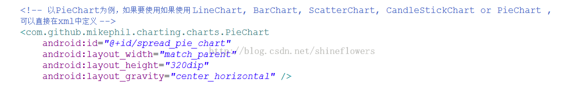
2. 定義xml文件
3. 主要Java邏輯代碼如下。
importjava.util.ArrayList;
importcom.github.mikephil.charting.charts.PieChart;
importcom.github.mikephil.charting.components.Legend;
importcom.github.mikephil.charting.components.Legend.LegendPosition;
importcom.github.mikephil.charting.data.Entry;
importcom.github.mikephil.charting.data.PieData;
importcom.github.mikephil.charting.data.PieDataSet;
import android.support.v7.app.ActionBarActivity;
importandroid.graphics.Color;
importandroid.os.Bundle;
importandroid.util.DisplayMetrics;
public class MainActivity extends ActionBarActivity {
privatePieChartmChart;
@Override
protected void onCreate(Bundle savedInstanceState) {
super.onCreate(savedInstanceState);
setContentView(R.layout.activity_main);
mChart = (PieChart) findViewById(R.id.spread_pie_chart);
PieDatamPieData = getPieData(4, 100);
showChart(mChart, mPieData);
}
private void showChart(PieChartpieChart, PieDatapieData) {
pieChart.setHoleColorTransparent(true);
pieChart.setHoleRadius(60f); //半徑
pieChart.setTransparentCircleRadius(64f); // 半透明圈
//pieChart.setHoleRadius(0) //實心圓
pieChart.setDescription("測試餅狀圖");
// mChart.setDrawYValues(true);
pieChart.setDrawCenterText(true); //餅狀圖中間可以添加文字
pieChart.setDrawHoleEnabled(true);
pieChart.setRotationAngle(90); // 初始旋轉角度
// draws the corresponding description value into the slice
// mChart.setDrawXValues(true);
// enable rotation of the chart by touch
pieChart.setRotationEnabled(true); // 可以手動旋轉
// display percentage values
pieChart.setUsePercentValues(true); //顯示成百分比
// mChart.setUnit(" €");
// mChart.setDrawUnitsInChart(true);
// add a selection listener
// mChart.setOnChartValueSelectedListener(this);
// mChart.setTouchEnabled(false);
// mChart.setOnAnimationListener(this);
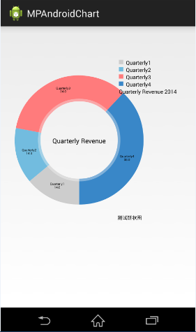
pieChart.setCenterText("Quarterly Revenue"); //餅狀圖中間的文字
//設置數據
pieChart.setData(pieData);
// undo all highlights
// pieChart.highlightValues(null);
// pieChart.invalidate();
Legend mLegend = pieChart.getLegend(); //設置比例圖
mLegend.setPosition(LegendPosition.RIGHT_OF_CHART); //最右邊顯示
// mLegend.setForm(LegendForm.LINE); //設置比例圖的形狀,默認是方形
mLegend.setXEntrySpace(7f);
mLegend.setYEntrySpace(5f);
pieChart.animateXY(1000, 1000); //設置動畫
// mChart.spin(2000, 0, 360);
}
/**
*
* @param count 分成幾部分
* @param range
*/
privatePieDatagetPieData(int count, float range) {
ArrayList<String>xValues = new ArrayList<String>(); //xVals用來表示每個餅塊上的內容
for (inti = 0; i< count; i++) {
xValues.add("Quarterly" + (i + 1)); //餅塊上顯示成Quarterly1, Quarterly2, Quarterly3, Quarterly4
}
ArrayList<Entry>yValues = new ArrayList<Entry>(); //yVals用來表示封裝每個餅塊的實際數據
// 餅圖數據
/**
* 將一個餅形圖分成四部分,四部分的數值比例為14:14:34:38
* 所以 14代表的百分比就是14%
*/
float quarterly1 = 14;
float quarterly2 = 14;
float quarterly3 = 34;
float quarterly4 = 38;
yValues.add(new Entry(quarterly1, 0));
yValues.add(new Entry(quarterly2, 1));
yValues.add(new Entry(quarterly3, 2));
yValues.add(new Entry(quarterly4, 3));
//y軸的集合
PieDataSetpieDataSet = new PieDataSet(yValues, "Quarterly Revenue 2014"/*顯示在比例圖上*/);
pieDataSet.setSliceSpace(0f); //設置個餅狀圖之間的距離
ArrayList<Integer> colors = new ArrayList<Integer>();
// 餅圖顏色
colors.add(Color.rgb(205, 205, 205));
colors.add(Color.rgb(114, 188, 223));
colors.add(Color.rgb(255, 123, 124));
colors.add(Color.rgb(57, 135, 200));
pieDataSet.setColors(colors);
DisplayMetrics metrics = getResources().getDisplayMetrics();
floatpx = 5 * (metrics.densityDpi / 160f);
pieDataSet.setSelectionShift(px); // 選中態多出的長度
PieDatapieData = new PieData(xValues, pieDataSet);
returnpieData;
}
}
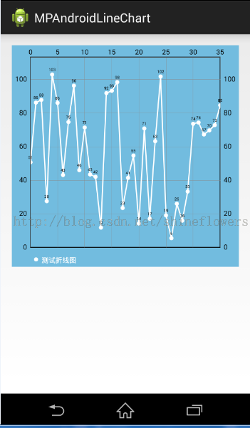
效果圖如下:
1. 將mpandroidchartlibrary-2-0-8.jar包copy到項目的libs中
2. 定義xml文件

3. 主要Java邏輯代碼如下。
packagecom.example.mpandroidlinechart;

importjava.util.ArrayList;

importcom.github.mikephil.charting.charts.LineChart;
importcom.github.mikephil.charting.components.Legend;
importcom.github.mikephil.charting.components.Legend.LegendForm;
importcom.github.mikephil.charting.data.Entry;
importcom.github.mikephil.charting.data.LineData;
importcom.github.mikephil.charting.data.LineDataSet;

import android.support.v7.app.ActionBarActivity;
importandroid.graphics.Color;
importandroid.os.Bundle;

public class MainActivity extends ActionBarActivity {

privateLineChartmLineChart;
//  private Typeface mTf;

    @Override
protected void onCreate(Bundle savedInstanceState) {
super.onCreate(savedInstanceState);
setContentView(R.layout.activity_main);

mLineChart = (LineChart) findViewById(R.id.spread_line_chart);

//      mTf = Typeface.createFromAsset(getAssets(), "OpenSans-Bold.ttf");

LineDatamLineData = getLineData(36, 100);
showChart(mLineChart, mLineData, Color.rgb(114, 188, 223));
    }

    // 設置顯示的樣式
private void showChart(LineChartlineChart, LineDatalineData, int color) {
lineChart.setDrawBorders(false);  //是否在折線圖上添加邊框

        // no description text
lineChart.setDescription("");// 數據描述
        // 如果沒有數據的時候,會顯示這個,類似listview的emtpyview
lineChart.setNoDataTextDescription("You need to provide data for the chart.");

        // enable / disable grid background
lineChart.setDrawGridBackground(false); // 是否顯示表格顏色
lineChart.setGridBackgroundColor(Color.WHITE& 0x70FFFFFF); // 表格的的顏色,在這裡是是給顏色設置一個透明度

        // enable touch gestures
lineChart.setTouchEnabled(true); // 設置是否可以觸摸

        // enable scaling and dragging
lineChart.setDragEnabled(true);// 是否可以拖拽
lineChart.setScaleEnabled(true);// 是否可以縮放

        // if disabled, scaling can be done on x- and y-axis separately
lineChart.setPinchZoom(false);//

lineChart.setBackgroundColor(color);// 設置背景

        // add data
lineChart.setData(lineData); // 設置數據

        // get the legend (only possible after setting data)
        Legend mLegend = lineChart.getLegend(); // 設置比例圖標示,就是那個一組y的value的

        // modify the legend ...
        // mLegend.setPosition(LegendPosition.LEFT_OF_CHART);
mLegend.setForm(LegendForm.CIRCLE);// 樣式
mLegend.setFormSize(6f);// 字體
mLegend.setTextColor(Color.WHITE);// 顏色
//      mLegend.setTypeface(mTf);// 字體

lineChart.animateX(2500); // 立即執行的動畫,x軸
      }

    /**
     * 生成一個數據
     * @param count 表示圖表中有多少個坐標點
     * @param range 用來生成range以內的隨機數
     * @return
     */
privateLineDatagetLineData(int count, float range) {
ArrayList<String>xValues = new ArrayList<String>();
for (inti = 0; i< count; i++) {
            // x軸顯示的數據,這裡默認使用數字下標顯示
xValues.add("" + i);
        }

        // y軸的數據
ArrayList<Entry>yValues = new ArrayList<Entry>();
for (inti = 0; i< count; i++) {
float value = (float) (Math.random() * range) + 3;
yValues.add(new Entry(value, i));
        }

        // create a dataset and give it a type
        // y軸的數據集合
LineDataSetlineDataSet = new LineDataSet(yValues, "測試折線圖" /*顯示在比例圖上*/);
        // mLineDataSet.setFillAlpha(110);
        // mLineDataSet.setFillColor(Color.RED);

        //用y軸的集合來設置參數
lineDataSet.setLineWidth(1.75f); // 線寬
lineDataSet.setCircleSize(3f);// 顯示的圓形大小
lineDataSet.setColor(Color.WHITE);// 顯示顏色
lineDataSet.setCircleColor(Color.WHITE);// 圓形的顏色
lineDataSet.setHighLightColor(Color.WHITE); // 高亮的線的顏色

ArrayList<LineDataSet>lineDataSets = new ArrayList<LineDataSet>();
lineDataSets.add(lineDataSet); // add the datasets

        // create a data object with the datasets
LineDatalineData = new LineData(xValues, lineDataSets);

returnlineData;
    }
}
效果圖如下:
1. 將mpandroidchartlibrary-2-0-8.jar包copy到項目的libs中
2. 定義xml文件
3. 主要Java邏輯代碼如下。
packagecom.jackie.mpandoidbarchart;
importjava.util.ArrayList;
importcom.github.mikephil.charting.charts.BarChart;
importcom.github.mikephil.charting.charts.LineChart;
importcom.github.mikephil.charting.components.Legend;
importcom.github.mikephil.charting.components.Legend.LegendForm;
importcom.github.mikephil.charting.components.XAxis;
importcom.github.mikephil.charting.components.XAxis.XAxisPosition;
importcom.github.mikephil.charting.data.BarData;
importcom.github.mikephil.charting.data.BarDataSet;
importcom.github.mikephil.charting.data.BarEntry;
import android.support.v7.app.ActionBarActivity;
importandroid.graphics.Color;
importandroid.os.Bundle;
public class MainActivity extends ActionBarActivity {
privateBarChartmBarChart;
privateBarDatamBarData;
@Override
protected void onCreate(Bundle savedInstanceState) {
super.onCreate(savedInstanceState);
setContentView(R.layout.activity_main);
mBarChart = (BarChart) findViewById(R.id.spread_bar_chart);
mBarData = getBarData(4, 100);
showBarChart(mBarChart, mBarData);
}
private void showBarChart(BarChartbarChart, BarDatabarData) {
barChart.setDrawBorders(false); ////是否在折線圖上添加邊框
barChart.setDescription("");// 數據描述
// 如果沒有數據的時候,會顯示這個,類似ListView的EmptyView
barChart.setNoDataTextDescription("You need to provide data for the chart.");
barChart.setDrawGridBackground(false); // 是否顯示表格顏色
barChart.setGridBackgroundColor(Color.WHITE& 0x70FFFFFF); // 表格的的顏色,在這裡是是給顏色設置一個透明度
barChart.setTouchEnabled(true); // 設置是否可以觸摸
barChart.setDragEnabled(true);// 是否可以拖拽
barChart.setScaleEnabled(true);// 是否可以縮放
barChart.setPinchZoom(false);//
// barChart.setBackgroundColor();// 設置背景
barChart.setDrawBarShadow(true);
barChart.setData(barData); // 設置數據
Legend mLegend = barChart.getLegend(); // 設置比例圖標示
mLegend.setForm(LegendForm.CIRCLE);// 樣式
mLegend.setFormSize(6f);// 字體
mLegend.setTextColor(Color.BLACK);// 顏色
// X軸設定
// XAxisxAxis = barChart.getXAxis();
// xAxis.setPosition(XAxisPosition.BOTTOM);
barChart.animateX(2500); // 立即執行的動畫,x軸
}
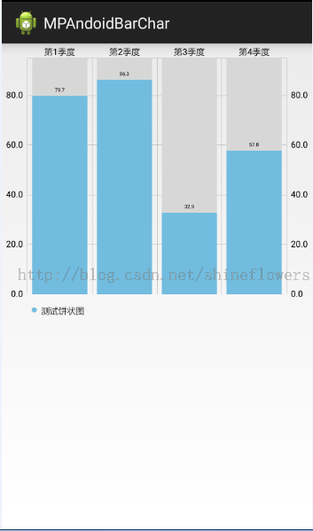
privateBarDatagetBarData(int count, float range) {
ArrayList<String>xValues = new ArrayList<String>();
for (inti = 0; i< count; i++) {
xValues.add("第" + (i + 1) + "季度");
}
ArrayList<BarEntry>yValues = new ArrayList<BarEntry>();
for (inti = 0; i< count; i++) {
float value = (float) (Math.random() * range/*100以內的隨機數*/) + 3;
yValues.add(new BarEntry(value, i));
}
// y軸的數據集合
BarDataSetbarDataSet = new BarDataSet(yValues, "測試餅狀圖");
barDataSet.setColor(Color.rgb(114, 188, 223));
ArrayList<BarDataSet>barDataSets = new ArrayList<BarDataSet>();
barDataSets.add(barDataSet); // add the datasets
BarDatabarData = new BarData(xValues, barDataSets);
returnbarData;
}
}
效果圖如下:
作者:傑瑞教育

 Android提高21篇之三:SurfaceView與多線程配合使用
上節中簡單介紹了SurfaceView的基本使用方法,本節主要講解SurfaceView與多線程的
 android發送郵件
android發送郵件 一個項目的需求,之前一篇博客寫過如何生成excel,生成後的excel要發送給用戶(指定郵箱)。奇葩的後台說這個發送也不好實現,要客戶端來做。
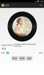 Android開發6:Service的使用(簡單音樂播放器的實現),androidservice
Android開發6:Service的使用(簡單音樂播放器的實現),androidservice前言 啦啦啦~各位好久不見啦~博主最近比較忙,而且最近一次實驗也是剛剛
 使文字出現波紋效果--第三方開源--Titanic,波紋--titanic
使文字出現波紋效果--第三方開源--Titanic,波紋--titanic 下載地址:https://github.com/RomainPiel/Titan