編輯:關於Android編程
Google在2015的IO大會上,給我們帶來了更加詳細的Material Design設計規范,同時,也給我們帶來了全新的Android Design Support Library,在這個support庫裡面,Google給我們提供了更加規范的MD設計風格的控件。最重要的是,Android Design Support Library的兼容性更廣,直接可以向下兼容到Android 2.2。
這兩天需要做一個仿京東詳情的頁面,上面的Tab切換,以前都是自己寫Viewpager+fragment,或者Indicator的深度定制,一直想嘗試一下TabLayout,於是就有了下面的坑。
然後下面是我簡單的實現效果(個人覺得很坑,還不如自己自定義的導航器)
添加引用庫
dependencies {
  compile fileTree(dir: 'libs', include: ['*.jar'])
  compile 'com.android.support:appcompat-v7:24.2.0'
  compile 'com.android.support:design:24.2.0'
  compile 'com.android.support:recyclerview-v7:24.2.0'
  compile 'com.android.support:cardview-v7:24.2.0'
}
Toolbar與TabLayout
我們來看一下實現的布局:
<?xml version="1.0" encoding="utf-8"?>
<LinearLayout xmlns:android="http://schemas.android.com/apk/res/android"
  xmlns:app="http://schemas.android.com/apk/res-auto"
  android:layout_width="match_parent"
  android:layout_height="match_parent"
  android:orientation="vertical">

  <android.support.v7.widget.Toolbar
    android:id="@+id/toolbar"
    android:layout_width="match_parent"
    android:layout_height="48dp"
    android:gravity="center_vertical"
    app:navigationIcon="@drawable/back_icon"
   >

    <LinearLayout
      android:layout_width="match_parent"
      android:layout_height="wrap_content"
      android:gravity="center"
      android:orientation="horizontal">

      <android.support.design.widget.TabLayout
        android:id="@+id/tabLayout"
        android:layout_width="match_parent"
        android:layout_height="match_parent"

        />

    </LinearLayout>

    <TextView
      android:layout_width="wrap_content"
      android:layout_height="wrap_content"
      android:layout_gravity="right"
      android:background="@drawable/more_icon" />

  </android.support.v7.widget.Toolbar>

  <View  />

  <android.support.v4.view.ViewPager
    android:id="@+id/viewPager"
    android:layout_width="match_parent"
    android:layout_height="match_parent" />
</LinearLayout>
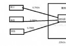
這布局文件最關鍵的一點就是android.support.design.widget.TabLayout 標簽中的app:tabMode=”scrollable”,他設置tab的模式為“可滑動的”。
其他的用法和Indicator的用法差不多,都需要設置適配器,然後通過數據實現頁面的適配。直接上代碼
Adapter
public class ProductDetailPagerAdapter extends FragmentPagerAdapter {

  private List<String> mTitles;

  public ProductDetailPagerAdapter(FragmentManager fm, List<String> mTitles) {
    super(fm);
    this.mTitles = mTitles;
  }

  @Override
  public Fragment getItem(int position) {
    if (position == 0) {
      return new ProductFragment();
    } else if (position == 1) {
      return new ProductDetailFragment();
    }
    return new ProductFragment();
  }

  @Override
  public int getCount() {
    return mTitles.size();
  }

  @Override
  public CharSequence getPageTitle(int position) {
    return mTitles.get(position);
  }
}
主頁面的相關邏輯,這裡的Fragment就是簡單的Fragment。
public class ProductDetailsActivity extends BaseActivity {
@BindView(R.id.viewPager)
ViewPager viewPager;
@BindView(R.id.tabLayout)
TabLayout tabLayout;
@BindView(R.id.toolbar)
Toolbar toolbar;
private TextView tabProduct;
private TextView tabDetail;
private List<String> mTitles = null;
private ProductDetailPagerAdapter productPagerAdapter = null;
@Override
protected void onCreate(Bundle savedInstanceState) {
super.onCreate(savedInstanceState);
setContentView(R.layout.activity_product_details);
ButterKnife.bind(this);
init();
}
private void init() {
initToolbar();
initViewPager();
}
private void initToolbar() {
setTitle("");
toolbar.setNavigationOnClickListener(new View.OnClickListener() {
@Override
public void onClick(View view) {
finish();
}
});
initTab();
initTabChange();
}
private void initTabChange() {
tabLayout.addOnTabSelectedListener(new TabLayout.OnTabSelectedListener() {
@Override
public void onTabSelected(TabLayout.Tab tab) {
viewPager.setCurrentItem(tab.getPosition());
switch (tab.getPosition()){
case 0:
tabProduct.setTextColor(getResources().getColor(R.color.c8));
tabProduct.setTextSize(18);
break;
case 1:
tabDetail.setTextColor(getResources().getColor(R.color.c8));
tabDetail.setTextSize(18);
break;
}
}
@Override
public void onTabUnselected(TabLayout.Tab tab) {
tabProduct.setTextColor(getResources().getColor(R.color.c7));
tabDetail.setTextColor(getResources().getColor(R.color.c7));
}
@Override
public void onTabReselected(TabLayout.Tab tab) {
}
});
}
private void initTab() {
tabLayout.setSelectedTabIndicatorColor(getResources().getColor(R.color.c8));
tabLayout.setSelectedTabIndicatorHeight(UIUtils.dp2px(this, 2));
tabLayout.setTabTextColors(R.color.c7, R.color.c8);
tabLayout.addTab(tabLayout.newTab().setCustomView(R.layout.item_detail_tab_product_layout));
tabProduct= (TextView) findViewById(R.id.tab_product);
tabProduct.setTextColor(getResources().getColor(R.color.c8));
tabLayout.addTab(tabLayout.newTab().setCustomView(R.layout.item_detail_tab_detail_layout));
tabDetail= (TextView) findViewById(R.id.tab_detail);
tabProduct.setTextColor(getResources().getColor(R.color.c7));
}
private void initViewPager() {
mTitles = new ArrayList<>();
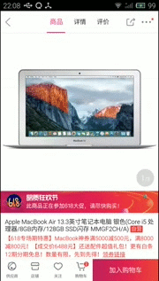
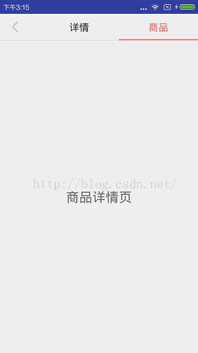
mTitles.add("商品");
mTitles.add("詳情");
productPagerAdapter = new ProductDetailPagerAdapter(getSupportFragmentManager(), mTitles);
viewPager.setAdapter(productPagerAdapter);
viewPager.addOnPageChangeListener(new ViewPager.SimpleOnPageChangeListener() {
@Override
public void onPageSelected(int position) {
tabLayout.getTabAt(position).select();
}
});
}
public static void open(Context context) {
Intent intent = new Intent(context, ProductDetailsActivity.class);
context.startActivity(intent);
}
}
我相信很多人看了上面的代碼會覺得很麻煩,其實我也覺得,這種雖然可定制高,但是相對於以前的寫法,代碼絲毫沒有減少,我還是建議使用自定義控件,之前有一篇Android萬能的指示器,大家可以借鑒借鑒。
以上就是本文的全部內容,希望對大家的學習有所幫助,也希望大家多多支持本站。
 Android開發之創建可點擊的Button實現方法
本文實例講述了Android創建可點擊的Button實現方法。分享給大家供大家參考,具體如下:感覺到自己有必要學習下手機開發方面的知識,不論是為了以後的工作需求還是目前的
 Android之多線程下載及斷點續傳
今天我們來接觸一下多線程下載,當然也包括斷點續傳,我們可以看到很多下載器,當開通會員的時候下載東西的速度就變得快了許多,這是為什麼呢?這就是跟今天講的多線程有關系了,其實
 OpenCV4Android開發 人臉識別篇
最近在android上用opencv搞人臉識別的 現在簡單展示下代碼。環境搭建我前面有寫,不會的自己看可以。 這個事用java api直接調用的更簡單了就,搭建都不需要直
 Android個人中心的頭像上傳,圖片編碼及截取實例
首先需要有網絡權限,然後我們這裡匹配的網絡請求是之前封裝好的Okhttp。非常的簡單方便,直接復制進去,依賴一下包,然後調用方法即可。 這裡是把圖片轉換成Base64.d