編輯:關於Android編程
ToggleButton(開關按鈕)和Switch(開關)講解:
一、核心屬性講解:
(1)ToggleButton
textOn:按鈕被選中的時候文字顯示
textOff:按鈕沒有被選中的時候文字顯示
ToggleButton的狀態只能是選中和未選中,並且需要為不同的狀態設置不同的顯示文本。
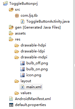
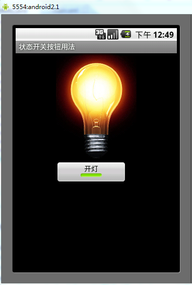
以下案例為ToggleButton的用法
目錄結構
main.xml布局文件
<?xml version="1.0" encoding="utf-8"?>
<LinearLayout xmlns:android="http://schemas.android.com/apk/res/android"
  android:orientation="vertical"
  android:layout_width="fill_parent"
  android:layout_height="fill_parent">
  <ImageView android:id="@+id/imageView"
    android:layout_width="wrap_content"
    android:layout_height="wrap_content"
    android:src="@drawable/bulb_off"
    android:layout_gravity="center_horizontal" />
  <ToggleButton android:id="@+id/toggleButton"
    android:layout_width="140dip"
    android:layout_height="wrap_content"
    android:textOn="開燈"
    android:textOff="關燈"
    android:layout_gravity="center_horizontal" />
</LinearLayout>
ToggleButtonActivity類
package com.ljq.tb;

import android.app.Activity;
import android.os.Bundle;
import android.widget.CompoundButton;
import android.widget.ImageView;
import android.widget.ToggleButton;
import android.widget.CompoundButton.OnCheckedChangeListener;

public class ToggleButtonActivity extends Activity {
  private ImageView imageView=null;
  private ToggleButton toggleButton=null;

  @Override
  public void onCreate(Bundle savedInstanceState) {
    super.onCreate(savedInstanceState);
    setContentView(R.layout.main);

    imageView=(ImageView) findViewById(R.id.imageView);
    toggleButton=(ToggleButton)findViewById(R.id.toggleButton);
    toggleButton.setOnCheckedChangeListener(new OnCheckedChangeListener(){

      public void onCheckedChanged(CompoundButton buttonView,
          boolean isChecked) {
        toggleButton.setChecked(isChecked);
        imageView.setImageResource(isChecked?R.drawable.bulb_on:R.drawable.bulb_off);
      }

    });
  }
}
運行效果:
(2)switch:
showText:設置textOn/off的時候文字是否顯示
android:showText:設置on/off的時候是否顯示文字,boolean
android:splitTrack:是否設置一個間隙,讓滑塊與底部圖片分隔,boolean
android:switchMinWidth:設置開關的最小寬度
android:switchPadding:設置滑塊內文字的間隔
android:textOff:按鈕沒有被選中時顯示的文字
android:textOn:按鈕被選中時顯示的文字
android:textStyle:文字風格,粗體,斜體寫劃線那些
android:track:底部的圖片
android:thumb:滑塊的圖片
可以自己動手試一試每一個屬性
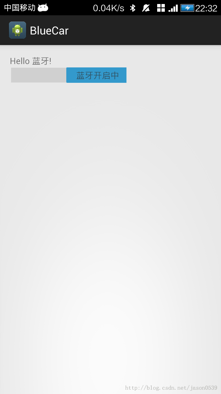
在做一個藍牙開關時候,用到了switch,記一下用法,其實跟Button是幾乎一樣的.
布局中:
<Switch
    android:id="@+id/open"
    android:layout_width="wrap_content"
    android:layout_height="wrap_content"
    android:textOff="藍牙關閉中"
    android:textOn="藍牙開啟中" />
java代碼中
open.setOnCheckedChangeListener(new OnCheckedChangeListener() {

      @Override
      public void onCheckedChanged(CompoundButton buttonView,
          boolean isChecked) {
        // TODO Auto-generated method stub
        if (isChecked) {
          mBluetoothAdapter.enable();//打開藍牙
        } else {
          mBluetoothAdapter.disable();// 關閉藍牙
        }
      }
    });
就是這樣了,一看就明白了.
 從零開始學android(Message消息機制.四十二.)
ndroid.os.Message的主要功能是進行消息的封裝,並且同時可以指定消息的操作形式。 No. 變量或方法 類型 描述 1 p
 Eclipse導入Android項目的正確方法
直接上圖: 在android 中導入項目後 包出現錯誤的解決方法 選中項目,右擊打開Proper
 自定義ImageView實現局部截圖功能
1、前言最近在做一個能夠自選區域進行局部截圖的功能,接下來,會給大家講解,整個截圖的實現過程。筆者這邊實現的自選區域的形狀是矩形,讀者如果有需要,可以根據我給大家講解的思
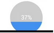 Android 實現自定義圓形進度條的實例代碼
Android 自定義圓形進度條今天無意中發現一個圓形進度,想想自己實現一個,如下圖:基本思路是這樣的:1.首先繪制一個實心圓2.繪制一個白色實心的正方形,遮住實心圓3.