編輯:關於Android編程
extends Button
state_checked : 已經被選中了
state_checkable: 可以被選中
給checkBox設置選擇器: (get新技能!!)
在設置之前我們先將選擇器列上
1, 給android:button=”@drawable/cb_sel設置背景選擇器
選擇器
cb_bg.xml
cb_bg_1.xml
cb_sel.xml
activity_main.xml
效果
我們通過一個模擬點贊的例子, 來說明點擊事件
首先來個顏色選擇器
activity_main.xml
注意, 需要將button置為空
並且將圖片放在控件頂部
給它著色, 可以使用 android:drawableTint=”@color/cb_color_sel”在xml中設置, 但是它是API23以後才可以使用 目前(2016-8-26)幾乎不能用, 所以我們要找一個兼容的辦法, 看MainActivity.java
MainActivity.java
CheckBox checkBox = (CheckBox) findViewById(R.id.main_cb);
//checkBox.setCompoundDrawableTintList();//API23之後可用
//獲取到四周的drawable, 分為左上中下
Drawable[] drawables = checkBox.getCompoundDrawables();
//拿到頂部 順序: 左上右下
Drawable top = drawables[1];
//top.setTint();最低版本21, 使用兼容包, 來兼容低版本手機
// 參數: 1, 給誰著色 2,獲取顏色列表
ColorStateList list = getResources().getColorStateList(R.color.cb_color_sel);
DrawableCompat.setTintList(top,
list);
DrawableCompat.setTintMode(top, PorterDuff.Mode.SRC_ATOP);
//設置監聽
checkBox.setOnCheckedChangeListener(this);
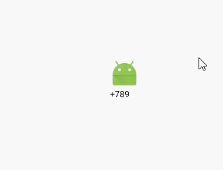
checkBox.setText("+" + count);
事件監聽方法
//點擊事件方法
@Override
public void onCheckedChanged(CompoundButton buttonView, boolean isChecked) {
    buttonView.setText("+" + (count + (isChecked ? 1 : 0)));
}
效果圖:
注意:
1, 一般情況下, 後面帶有 ~Compat的, 為支持包;
2, checkBox.getCompoundDrawables();返回的是該控件在四周的drawable, 一個四個, 0 - 3 (包含) , 順序是, 左上右下
布局文件
style文件
上述注釋代碼, API23才可以使用
Activity代碼
//單選按鈕 著色
RadioGroup radioGroup = (RadioGroup) findViewById(R.id.main_group);
for (int i = 0; i < radioGroup.getChildCount(); i++) {
    RadioButton button = (RadioButton) radioGroup.getChildAt(i);
    Drawable drawable = button.getCompoundDrawables()[1];
    DrawableCompat.setTintList(drawable, list);
    DrawableCompat.setTintMode(drawable, PorterDuff.Mode.SRC_ATOP);
}
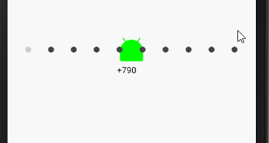
效果圖
背景選擇器
nav_bg.xml
nav_bg_1.xml
nav_sel.xml
main.xml 布局文件
Activity代碼
LayoutInflater inflater = LayoutInflater.from(this);
 navigation = (RadioGroup) findViewById(R.id.main_navigation);
 for (int i = 0; i < 10; i++) {
     //                     第二個參數不要指定為空, 第三個,加不加載上, 如果寫true就返回父控件, 否則返回
     View radioButton = inflater.inflate(R.layout.radio_child, navigation, false);
     radioButton.setId(i);
     navigation.addView(radioButton);
 }
 navigation.check(0);
事件監聽方法
    @Override
    public void onCheckedChanged(CompoundButton buttonView, boolean isChecked) {

        //點擊上方圖片實現

//        實現輪播
        int i = navigation.getCheckedRadioButtonId();
        i++;
        if (i >= navigation.getChildCount()) {
            i = 0;
        }
        navigation.check(i);
    }
簡單說一下適配器視圖: AdapterView extens ViewGroup
它是負責將數據源未來該怎樣顯示在屏幕上
strings.xml
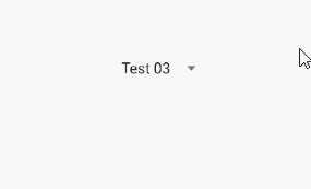
- Test 01
- Test 02
- Test 03
- Test 04
- Test 05
main.xml
效果圖
該種方式, 局限太大, 使用頻率較小
View絕對不能直接操作數據源, 數據源永遠是通過控制器來操作
布局文件
Activity代碼
/**
* 下拉列表
*/
public class MainActivity extends AppCompatActivity implements AdapterView.OnItemSelectedListener {
private ArrayAdapter adapter;
private ArrayAdapter adapter_1;
private ArrayAdapter adapter_2;
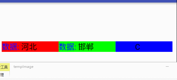
private static final String[] PROVINCES = {"北京", "河北", "山東"};
private static final String[][] CITIES = {{"北京"}, {"石家莊", "邯鄲", "衡水", "張家口"}, {"濟南", "泰安", "青島", "日照"}};
private static final String[][][] AREAS = { { {"海澱", "昌平", "朝陽", "東城", "西城"} }, {{"A", "B"}, {"C", "D"}, {} , {} }, { {}, {}, {}, {} } };
private Spinner spinner;
private Spinner spinner_1;
private Spinner spinner_2;
@Override
protected void onCreate(Bundle savedInstanceState) {
super.onCreate(savedInstanceState);
setContentView(R.layout.activity_main);
spinner = (Spinner) findViewById(R.id.main_spinner);
spinner_1 = (Spinner) findViewById(R.id.main_spinner_1);
spinner_2 = (Spinner) findViewById(R.id.main_spinner_2);
// 上下文對象(主要用來創建View, 只要你想創建任何View, 都需要上下文對象) 視圖 數據源
adapter = new ArrayAdapter<>(this,R.layout.spinner_child,R.id.item_text, new ArrayList(Arrays.asList(PROVINCES)));
adapter_1 = new ArrayAdapter<>(this,R.layout.spinner_child,R.id.item_text, new ArrayList(Arrays.asList(CITIES[0])));
adapter_2 = new ArrayAdapter<>(this,R.layout.spinner_child,R.id.item_text, new ArrayList(Arrays.asList(AREAS[0][0])));
spinner.setAdapter(adapter);
spinner_1.setAdapter(adapter_1);
spinner_2.setAdapter(adapter_2);
// findViewById(R.id.main_add).setOnClickListener(this);
//不讓開發者調用, 直接拋出異常
// spinner.setOnItemClickListener();
spinner.setOnItemSelectedListener(this);
spinner_1.setOnItemSelectedListener(this);
spinner_2.setOnItemSelectedListener(this);
}
/*****************************/
//選中時調用
@Override //對應的spinner 哪個View被選中了 位置 ArrayAdapter中position和id相同(以後自己寫得Adapter必須用自己的id)
public void onItemSelected(AdapterView parent, View view, int position, long id) {
switch (parent.getId()) {
case R.id.main_spinner:
adapter_1.clear();
adapter_1.addAll(CITIES[position]);
adapter_2.clear();
adapter_2.addAll(AREAS[spinner.getSelectedItemPosition()][position]);
break;
case R.id.main_spinner_1:
adapter_2.clear();
adapter_2.addAll(AREAS[spinner.getSelectedItemPosition()][position]);
if (adapter_2.isEmpty()) {
spinner_2.setVisibility(View.INVISIBLE);
} else {
spinner_2.setVisibility(View.VISIBLE);
}
break;
case R.id.main_spinner_2:
StringBuilder builder = new StringBuilder();
builder.append(spinner.getSelectedItem()).append(":")
.append(spinner_1.getSelectedItem()).append(":")
.append(spinner_2.getSelectedItem());
Toast.makeText(MainActivity.this, builder.toString(), Toast.LENGTH_SHORT).show();
break;
}
}
//未選中調用
@Override
public void onNothingSelected(AdapterView parent) {
}
}
效果圖:
 android應用Theme(二)
第二種實現android應用Theme的方式是通過apk來實現的。下面是一個demo。 1.首先必須新建一個apk,類似的插件,然後在該apk的Androi
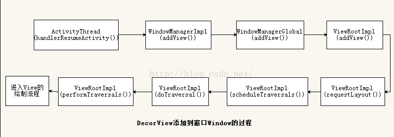 android6.0 Activity(五) Activity的測量(Measure)、布局(Layout)和繪制(Draw)
Android應用程序窗口的繪圖表面在創建完成之後,我們就可以從上到下地繪制它裡面的各個視圖了,即各個UI元素了。不過在繪制這些UI元素之前,我們還需要從上到下地測量它們
 Android程序測試
一、建立測試環境 安裝了Android Developer Tools (ADT) 插件的Eclipse將為你創建,構建,以及運行Android程序提供一個基於圖形界面的
 Android評論圖片可移動順序選擇器(推薦)
好久沒寫了,現在在廣州一家公司實習了,來了一個月了,實習生沒什麼事干,看到公司一個項目。Android和iOS的做的不一樣(ios做這個項目的人多,額不解釋。。原來做這個