編輯:關於Android編程
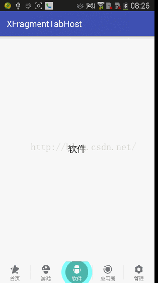
現在新版360手機助手的界面都做得挺漂亮的,在切換底部導航時的波紋效果也很好看,剛好最近看了個開源項目才了解到原來Drawable做動畫效果也怎麼好用,所以就仿照360實現了下帶波紋的TabHost。源代碼地址:https://github.com/Rukey7/XFragmentTabHost
先來看一下實現後的效果:
說明一下實現要點:
1. 因為我們項目之前用的是FragmentTabHost,所以我直接繼承FragmentTabHost來實現動畫效果更方便;
2. 波紋動畫的實現其實是自定義帶動畫效果的Drawable,然後將Drawable設置為Tab菜單的背景;
3. 其它的就是一些Tab菜單切換的處理了。
一. 自定義波紋Drawable
自定義Drawable只要繼承Drawable並實現以下4個方法,同時實現Animatable接口:
public class RippleDrawable extends Drawable implements Animatable {
    @Override
    public void draw(Canvas canvas) {
        // 繪圖
    }

    @Override
    public void setAlpha(int alpha) {
        // 設置透明度
    }

    @Override
    public void setColorFilter(ColorFilter colorFilter) {
        // 設置顏色過濾
    }

    @Override
    public int getOpacity() {
        // 設置顏色格式
        return PixelFormat.RGBA_8888;
    }

    @Override
    public void start() {
        // 啟動動畫
    }

    @Override
    public void stop() {
        // 停止動畫
    }

    @Override
    public boolean isRunning() {
        // 判斷動畫是否運行
        return false;
    }
}
這幾個方法中最重要的就是draw()方法了,相信自定義過View的都知道我們圖形就是在這裡繪制,這裡也一樣,其它方法在這裡影響不大,最後一個方法用來設置Drawable的顏色格式。要實現動畫Drawable需要實現Animatable接口,並實現3個方法如下,其實不實現這個接口也能做動畫效果,但還是實現比較好。
下面是整個波紋Drawable的實現代碼:
/**
 * Created by long on 2016/6/27.
 * 波紋Drawable
 */
public class RippleDrawable extends Drawable implements Animatable {

    /**
     * 3種模式:左邊、中間和右邊波紋
     */
    public static final int MODE_LEFT = 1;
    public static final int MODE_MIDDLE = 2;
    public static final int MODE_RIGHT = 3;

    private int mMode = MODE_MIDDLE;
    // 前景色和後景色畫筆
    private Paint mPaintFront;
    private Paint mPaintBehind;
    // 用來繪制扇形的矩形框
    private RectF mRect;
    // 目標View的寬高的一半
    private int mHalfWidth;
    private int mHalfHeight;
    // 擴散半徑
    private int mRadius;
    // 前景色和背景色的分割距離
    private int mDivideSpace;
    // 擴散滿視圖需要的距離,中點到斜角的距離
    private int mFullSpace;
    // 動畫控制
    private ValueAnimator mValueAnimator;


    public RippleDrawable(int frontColor, int behindColor, int mode) {
        mPaintFront = new Paint(Paint.ANTI_ALIAS_FLAG);
        mPaintFront.setColor(frontColor);
        mPaintBehind = new Paint(Paint.ANTI_ALIAS_FLAG);
        mPaintBehind.setColor(behindColor);
        mRect = new RectF();
        mMode = mode;
    }

    @Override
    public void draw(Canvas canvas) {
        if (mRadius > mHalfWidth) {
            int count = canvas.save();
            canvas.drawCircle(mHalfWidth, mHalfHeight, mHalfWidth, mPaintBehind);
            canvas.restoreToCount(count);
            count = canvas.save();
            canvas.drawCircle(mHalfWidth, mHalfHeight, mDivideSpace, mPaintFront);
            canvas.restoreToCount(count);
        } else if (mRadius > mDivideSpace) {
            int count = canvas.save();
            canvas.drawCircle(mHalfWidth, mHalfHeight, mRadius, mPaintBehind);
            canvas.restoreToCount(count);
            count = canvas.save();
            canvas.drawCircle(mHalfWidth, mHalfHeight, mDivideSpace, mPaintFront);
            canvas.restoreToCount(count);
        } else {
            canvas.drawCircle(mHalfWidth, mHalfHeight, mRadius, mPaintFront);
        }

        // 左右兩邊才進行扇形繪制
        if (mMode != MODE_MIDDLE) {
            mRect.left = mHalfWidth - mRadius;
            mRect.right = mHalfWidth + mRadius;
            mRect.top = mHalfHeight - mRadius;
            mRect.bottom = mHalfHeight + mRadius;
        }
        if (mMode == MODE_LEFT) {
            canvas.drawArc(mRect, 90, 180, true, mPaintFront);
        } else if (mMode == MODE_RIGHT) {
            canvas.drawArc(mRect, -90, 180, true, mPaintFront);
        }
    }

    @Override
    public void setAlpha(int alpha) {
    }

    @Override
    public void setColorFilter(ColorFilter colorFilter) {
    }

    @Override
    public int getOpacity() {
        return PixelFormat.RGBA_8888;
    }

    @Override
    protected void onBoundsChange(Rect bounds) {
        super.onBoundsChange(bounds);
        mHalfHeight = (bounds.bottom - bounds.top) / 2;
        mHalfWidth = (bounds.right - bounds.left) / 2;
        mDivideSpace = Math.max(mHalfHeight, mHalfWidth) * 3 / 4;
        mFullSpace = (int) Math.sqrt(mHalfWidth * mHalfWidth + mHalfHeight * mHalfHeight);
        // 屬性動畫
        mValueAnimator = ValueAnimator.ofInt(0, mFullSpace);
        mValueAnimator.addUpdateListener(new ValueAnimator.AnimatorUpdateListener() {
            @Override
            public void onAnimationUpdate(ValueAnimator animation) {
                mRadius = (int) animation.getAnimatedValue();
                invalidateSelf();
            }
        });
        mValueAnimator.setDuration(200);
        start();
    }


    @Override
    public void start() {
        mValueAnimator.start();
    }

    @Override
    public void stop() {
        mValueAnimator.end();
    }

    @Override
    public boolean isRunning() {
        return mValueAnimator != null && mValueAnimator.isRunning();
    }
}
整體還是比較簡單的,主要就是繪圖那裡需要繪制3個圖形,一個前景色的圓形、一個後景色的圓形和左右兩邊的扇形。在繪制前需要計算前景色和後景色繪制的半徑,中點都為Tab視圖的中心。這裡需要實現onBoundsChange(Rect bounds)方法,在這裡可以獲取到Tab菜單項的尺寸信息,這裡的mDivideSpace是前景色圓形的半徑,也就是前景和後景的分割距離,而後景色圓形半徑為Tab項寬度的一半。最後就剩下左右兩邊需要填充Tab邊角的扇形半徑mFullSpace了,距離就是中心到Tab邊角點的距離了。
當然了,要實現動畫效果肯定不止這些,還有一個重要的ValueAnimator,通過它來控制波紋的擴散半徑,用法還是很簡單的,用過屬性動畫的應該都不陌生。這裡面需要注意的是裡面調用了一個方法invalidateSelf() ,Drawable是通過這個方法來進行重繪的,它會重新調用draw()方法來實現波紋效果。
二. 實現擴展的FragmentTabHost
要實現擴展的FragmentTabHost需要繼承它並實現一個重要的方法setCurrentTab(int index),當FragmentTabHost在選擇Tab菜單時會調用該方法,在這方法裡我們可以得到當前選中的項和之前選中的項,並做動畫處理。
在實現FragmentTabHost之前,我們的Tab菜單布局生成也通過這裡實現,並提供方法讓外面調用,首先是菜單布局:
這個很簡單,就是圖標和標題,和正常使用沒區別。然後是Tab菜單類:
/**
 * Created by long on 2016/4/15.
 * Tab項
 */
public class TabItem {

    private String title;
    private int imageRes;

    public TabItem(String title, int imageRes) {
        this.title = title;
        this.imageRes = imageRes;
    }

    public String getTitle() {
        return title;
    }

    public void setTitle(String title) {
        this.title = title;
    }

    public int getImageRes() {
        return imageRes;
    }

    public void setImageRes(int imageRes) {
        this.imageRes = imageRes;
    }
}
同樣很簡單,和布局文件對應一個圖標和一個標題。
最後看下擴展FragmentTabHost的實現:
/**
 * Created by long on 2016/4/15.
 * 擴展TabHost
 */
public class XFragmentTabHost extends FragmentTabHost {

    private Context mContext;
    private List mTabViews;
    private List mTabItems;
    // 字體激活顏色
    private int mTextActiveColor;
    private int mTextInactiveColor;
    // 字體激活大小
    private float mTextActiveSize;
    private float mTextInactiveSize;
    // 視圖激活對頂部的偏移
    private int mViewActivePaddingTop;
    private int mViewInactivePaddingTop;
    // 波紋模式的前景顏色和後景顏色
    private int mFrontColor;
    private int mBehindColor;
    // TabHost模式
    private TabMode mTabMode;


    public XFragmentTabHost(Context context) {
        super(context);
        _init(context);
    }

    public XFragmentTabHost(Context context, AttributeSet attrs) {
        super(context, attrs);
        _init(context);
    }

    private void _init(Context context) {
        mTabViews = new ArrayList<>();
        mTabItems = new ArrayList<>();
        mContext = context;
        mTextActiveColor = ContextCompat.getColor(mContext, R.color.colorActive);
        mTextInactiveColor = ContextCompat.getColor(mContext, R.color.colorInactive);
        mFrontColor = ContextCompat.getColor(mContext, R.color.colorFront);
        mBehindColor = ContextCompat.getColor(mContext, R.color.colorBehind);
        mTextActiveSize = getResources().getDimension(R.dimen.tab_text_size_active);
        mTextInactiveSize = getResources().getDimension(R.dimen.tab_text_size_inactive);
        mViewActivePaddingTop = (int) getResources().getDimension(R.dimen.tab_padding_top_active);
        mViewInactivePaddingTop = (int) getResources().getDimension(R.dimen.tab_padding_top_inactive);
        mTabMode = TabMode.MoveToTop;
    }

    /**
     * 覆寫父類接口,並在這裡做些動畫特效
     * @param index 當前選中的Tab項
     */
    @Override
    public void setCurrentTab(int index) {
        // 獲取之前選中的index
        int lastIndex = getCurrentTab();
        super.setCurrentTab(index);
        // 選中不同的Tab項才做切換處理
        if (lastIndex != index) {
            _switchTab(lastIndex, index);
        }
    }

    /**
     * 添加TabItem
     * @param item  TabItem
     * @param fragClass fragment類名
     * @param bundle 傳給fragment的參數
     */
    public void addTabItem(TabItem item, Class fragClass, Bundle bundle) {
        mTabItems.add(item);
        View view = _getIndicator(item);
        mTabViews.add(view);
        this.addTab(newTabSpec(item.getTitle()).setIndicator(view), fragClass, bundle);
    }

    /**
     * 獲取TabItem視圖
     * @param item TabItem
     * @return
     */
    private View _getIndicator(TabItem item) {
        View view = LayoutInflater.from(mContext).inflate(R.layout.tab_indicator, null);
        ImageView imageView = (ImageView) view.findViewById(R.id.tab_icon);
        TextView title = (TextView) view.findViewById(R.id.tab_title);
        imageView.setImageResource(item.getImageRes());
        title.setText(item.getTitle());
        title.setTextColor(mTextInactiveColor);
        return view;
    }

    /**
     * 切換Tab
     * @param lastIndex 上一個選中索引
     * @param nextIndex 下一個選中索引
     */
    private void _switchTab(int lastIndex, int nextIndex) {
        for (int i = 0; i < mTabViews.size(); i++) {
            if (i == lastIndex) {
                _doRipple(i, false);
            } else if (i == nextIndex) {
                _doRipple(i, true);
            }
        }
    }

    /**
     * 波紋處理
     * @param index 索引
     * @param isActivated 是否激活
     */
    private void _doRipple(int index, boolean isActivated) {
        View view = mTabViews.get(index);
        View tabView = view.findViewById(R.id.tab_layout);
        TextView title = (TextView) view.findViewById(R.id.tab_title);
        if (index == 0) {
            _rippleDrawable(tabView, mFrontColor, mBehindColor, RippleDrawable.MODE_LEFT, isActivated);
        } else if (index == (mTabViews.size() - 1)){
            _rippleDrawable(tabView, mFrontColor, mBehindColor, RippleDrawable.MODE_RIGHT, isActivated);
        } else {
            _rippleDrawable(tabView, mFrontColor, mBehindColor, RippleDrawable.MODE_MIDDLE, isActivated);
        }
        if (isActivated) {
            title.setTextColor(mTextActiveColor);
        } else {
            title.setTextColor(mTextInactiveColor);
        }
    }

    /**
     * 波紋動畫
     * @param view
     * @param frontColor
     * @param behindColor
     * @param mode
     * @param isActivated
     */
    @SuppressWarnings("deprecation")
    private void _rippleDrawable(final View view, int frontColor, int behindColor, int mode, boolean isActivated) {
        if (isActivated) {
            RippleDrawable rippleDrawable = new RippleDrawable(frontColor, behindColor, mode);
            if (Build.VERSION.SDK_INT >= Build.VERSION_CODES.JELLY_BEAN) {
                view.setBackground(rippleDrawable);
            } else {
                view.setBackgroundDrawable(rippleDrawable);
            }
        } else {
            if (Build.VERSION.SDK_INT >= Build.VERSION_CODES.JELLY_BEAN) {
                view.setBackground(null);
            } else {
                view.setBackgroundDrawable(null);
            }
        }
    }

    /**
     * 屬性設置
     * @return
     */
    public int getTextActiveColor() {
        return mTextActiveColor;
    }

    public void setTextActiveColor(int textActiveColor) {
        mTextActiveColor = textActiveColor;
    }

    public int getTextInactiveColor() {
        return mTextInactiveColor;
    }

    public void setTextInactiveColor(int textInactiveColor) {
        mTextInactiveColor = textInactiveColor;
    }

    public int getFrontColor() {
        return mFrontColor;
    }

    public void setFrontColor(int frontColor) {
        mFrontColor = frontColor;
    }

    public int getBehindColor() {
        return mBehindColor;
    }

    public void setBehindColor(int behindColor) {
        mBehindColor = behindColor;
    }
}
其實也不會復雜,就是在切換Tab菜單時,對選中菜單設置背景為RippleDrawable,對之前的菜單背景設置為空,就這麼簡單^ ^,使用的話大體和FragmentHost是基本一樣的,就添加Tab菜單使用上面實現的方法addTabItem(TabItem item, ClassfragClass, Bundle bundle)就行了,具體下載源代碼查看。
這個TabHost實現還是不復雜,處理波紋效果外,源代碼裡還有一些其它動畫效果,實現思路都一樣,有興趣也可以自己定制些更好看的動畫效果~
 標題欄的公共抽取
一、情形描述在常使用的頁面布局中,為保持用戶一貫的使用風格,會保持頁面的整體風格相似。除開底部導航外,標題欄是使用頻率較高的另一種頁面布局。如圖所示:在程序猿&ldquo
 Android變形(Transform)之Matrix用法
引言最近在研究Android的變形,Android的2D變形(包括縮放,扭曲,平移,旋轉等)可以通過Matrix來實現,3D變形可以通過Camera來實現。接下來就將我這
 android開發步步為營之35:GridView的用法
之前使用asp.net開發軟件的過程中也使用GridView,發現android裡面也有這麼一個控件,使用方法有點相似,都是使用適配器將數據綁定到這個控件,
 Kotlin在Android工程中的應用
Kotlin在Android工程中的應用 @author ASCE1885的 Github 簡書 微博 CSDN 原文鏈接簡介Kotlin是由JetBrains設計的開放