編輯:Android資訊
本文由碼農網 – 楊小勇原創,轉載請看清文末的轉載要求,歡迎參與我們的付費投稿計劃!
Android總體有五大布局:

線性布局在開發中使用最多,具有垂直方向與水平方向的布局方式,通過設置屬性“android:orientation”控制方向,屬性值垂直(vertical)和水平(horizontal),默認水平方向。
在使用orientation時需要注意一個問題,假如我們使用默認布局方向,即水平方向,若LinearLayout中存在不止一個控件且都未設置具體寬度,即這樣的布局代碼:
<LinearLayout
    android:layout_width="match_parent"
    android:layout_height="match_parent">
    <TextView
        android:layout_width="match_parent"
        android:layout_height="wrap_content"/>
    <TextView
        android:layout_width="match_parent"
        android:layout_height="wrap_content"/>
</LinearLayout>
則會出現下面的錯誤:

這個錯誤告訴我們在有多個子控件時需要設置布局方向或至少設置一個子控件在該布局方向的大小,我們可以顯示設置布局方向或設置某一個子控件的寬度。
除orientation之外還有以下常用屬性:
android:gravity:內部控件對齊方式,常用屬性值有center、center_vertical、center_horizontal、top、bottom、left、right等。這個屬性在布局組件RelativeLayout、TableLayout中也有使用,FrameLayout、AbsoluteLayout則沒有這個屬性。
center:居中顯示,這裡並不是表示顯示在LinearLayout的中心,當LinearLayout線性方向為垂直方向時,center表示水平居中,但是並不能垂直居中,此時等同於center_horizontal的作用;同樣當線性方向為水平方向時,center表示垂直居中,等同於center_vertical。
top、bottom、left、right顧名思義為內部控件居頂、低、左、右布局。
這裡要與android:layout_gravity區分開,layout_gravity是用來設置自身相對於父元素的布局。
android:layout_weight:權重,用來分配當前控件在剩余空間的大小。正常情況下,值越大占據高度或寬度越大。例外的情況,在LineayLayout布局中使用這個屬性時需要注意: 當水平方向布局且子控件的寬度為fill_parent或match_parent時,值越小占據寬度越大,垂直方向也一樣。分析一下這種情況,類似這樣的代碼:
<?xml version="1.0" encoding="utf-8"?>
<LinearLayout xmlns:android="http://schemas.android.com/apk/res/android"
    android:orientation="horizontal" android:layout_width="match_parent"
    android:layout_height="match_parent">

    <TextView
        android:layout_width="match_parent"
        android:layout_height="40dp"
        android:background="#666666"
        android:text="第一個子控件"
        android:gravity="center"
        android:layout_weight="1"/>
    <TextView
        android:layout_width="match_parent"
        android:layout_height="40dp"
        android:background="#EE4000"
        android:text="第二個子控件"
        android:gravity="center"
        android:layout_weight="2"/>

</LinearLayout>
顯示效果:

這裡出現這種情況主要是因為match_parent或fill_parent引起的,系統先給第一個子控件分配parent_width(剩余空間),再給第二個分配parent_width,即分配了兩個parent_width,此時剩余為parent_width-2parent_width=-parent_width,這裡主要問題就在這裡,剩余控件其實已經為一個負數了。接著,第一個控件占寬度:parent_width(當前已有寬度)+權重1/3*(-parent_width)=2/3parent_width;第二個控件占寬度:parent_width+權重2/3*(-parent_width)=1/3parent_width,所以當寬度都是match_parent時,剩余空間則為負數,誰的權重大誰就會減去越多。
在平常開發中我們會經常用到這個屬性,通過設置layout_weight能解決很多不可思議的布局問題。
幀布局或叫層布局,從屏幕左上角按照層次堆疊方式布局,後面的控件覆蓋前面的控件。該布局在開發中經常用到,因為是按層次方式布局,我們需要實現層面顯示的樣式時就可以采用這種布局方式,比如我們要實現一個類似百度地圖的布局:

通過這張圖我們可以看到地圖與操作按鈕是分層顯示的,運用FrameLayout我們也可以簡單實現這樣的樣式,代碼如下:
<?xml version="1.0" encoding="utf-8"?>
<FrameLayout xmlns:android="http://schemas.android.com/apk/res/android"
    android:layout_width="match_parent"
    android:layout_height="match_parent">

    <com.baidu.mapapi.map.MapView
        android:id="@+id/mapShowView"
        android:layout_width="fill_parent"
        android:layout_height="fill_parent"
        android:clickable="true"/>

    <EditText
        android:layout_width="match_parent"
        android:layout_height="40sp"
        android:background="@drawable/edit_selector"
        android:layout_marginLeft="20sp"
        android:layout_marginRight="20sp"
        android:layout_marginTop="30dp"
        android:paddingLeft="10sp"
        android:textSize="14sp"
        android:hint="搜地點、查公交、找路線"
        android:textColorHint="#aaaaaa"
        android:gravity="left|center_vertical"/>

    <LinearLayout
        android:layout_width="wrap_content"
        android:layout_height="wrap_content"
        android:orientation="vertical"
        android:layout_gravity="right"
        android:layout_marginTop="80dp"
        android:layout_marginRight="20dp">

        <Button
            android:id="@+id/traffic"
            android:layout_width="45sp"
            android:layout_height="45sp"
            android:text="路況"
            android:textColor="#ffffff"
            android:textSize="14sp"
            android:background="@drawable/corner_black_bgborder"/>

        <Button
            android:id="@+id/panorama"
            android:layout_width="45sp"
            android:layout_height="45sp"
            android:text="全景"
            android:textColor="#ffffff"
            android:textSize="14sp"
            android:layout_marginTop="10dp"
            android:background="@drawable/corner_black_bgborder"/>

        <Button
            android:id="@+id/company"
            android:layout_width="45sp"
            android:layout_height="45sp"
            android:text="同行"
            android:textColor="#ffffff"
            android:textSize="14sp"
            android:layout_marginTop="10dp"
            android:background="@drawable/corner_black_bgborder"/>

    </LinearLayout>

    <Button
        android:id="@+id/location"
        android:layout_width="45sp"
        android:layout_height="45sp"
        android:layout_gravity="bottom"
        android:text="定位"
        android:textColor="#ffffff"
        android:textSize="14sp"
        android:layout_marginLeft="20dp"
        android:layout_marginBottom="120dp"
        android:background="@drawable/corner_black_bgborder"/>
</FrameLayout>
顯示效果:

FrameLayout中第一個子控件為百度地圖,其次為輸入框、右邊操作按鈕與左下方定位按鈕。我們可以看到這裡很多子控件都使用了一個屬性,layout_gravity,正如前面講解gravity屬性提到的一樣,layout_gravity用來設置自身相對於父元素的布局,這個屬性在FrameLayout布局時會經常使用到,用來控制控件在布局中的位置,layout_gravity常用屬性值有top、bottom、left、right、center、center_horizontal、center_vertical,這裡的center可以讓控件居於FrameLayout的中心布局,屬性值可以復合使用,比如我們既要居底部布局又要垂直居中就可以這樣設置:“android:layout_gravity=bottom|center_vertical”。
代碼中的操作控件分三個布局位置,頂部的搜索框、右邊的操作按鈕、左下方的定位按鈕。以下為這三部分的講解:
相對布局可以讓子控件相對於兄弟控件或父控件進行布局,可以設置子控件相對於兄弟控件或父控件進行上下左右對齊。RelativeLayout能替換一些嵌套視圖,當我們用LinearLayout來實現一個簡單的布局但又使用了過多的嵌套時,就可以考慮使用RelativeLayout重新布局。
RelativeLayout中子控件常用屬性:
1、相對於父控件,例如:android:layout_alignParentTop=“true”
android:layout_alignParentTop 控件的頂部與父控件的頂部對齊;
android:layout_alignParentBottom 控件的底部與父控件的底部對齊;
android:layout_alignParentLeft 控件的左部與父控件的左部對齊;
android:layout_alignParentRight 控件的右部與父控件的右部對齊;
2、相對給定Id控件,例如:android:layout_above=“@id/**”
android:layout_above 控件的底部置於給定ID的控件之上;
android:layout_below 控件的底部置於給定ID的控件之下;
android:layout_toLeftOf 控件的右邊緣與給定ID的控件左邊緣對齊;
android:layout_toRightOf 控件的左邊緣與給定ID的控件右邊緣對齊;
android:layout_alignBaseline 控件的baseline與給定ID的baseline對齊;
android:layout_alignTop 控件的頂部邊緣與給定ID的頂部邊緣對齊;
android:layout_alignBottom 控件的底部邊緣與給定ID的底部邊緣對齊;
android:layout_alignLeft 控件的左邊緣與給定ID的左邊緣對齊;
android:layout_alignRight 控件的右邊緣與給定ID的右邊緣對齊;
3、居中,例如:android:layout_centerInParent=“true”
android:layout_centerHorizontal 水平居中;
android:layout_centerVertical 垂直居中;
android:layout_centerInParent 父控件的中央;
應用實例:
<?xml version="1.0" encoding="utf-8"?>
<LinearLayout xmlns:android="http://schemas.android.com/apk/res/android"
    android:layout_width="match_parent"
    android:layout_height="match_parent">

    <RelativeLayout
        android:layout_width="match_parent"
        android:layout_height="50dp"
        android:background="@drawable/topbar_bg_border">

        <TextView
            android:layout_width="wrap_content"
            android:layout_height="wrap_content"
            android:layout_centerInParent="true"
            android:text="標題"
            android:textSize="19sp"
            android:text
            android:textColor="#4e6288"/>

        <TextView
            android:layout_width="wrap_content"
            android:layout_height="wrap_content"
            android:layout_centerVertical="true"
            android:layout_alignParentRight="true"
            android:layout_marginRight="15dp"
            android:text="取消"
            android:textSize="18sp"/>

    </RelativeLayout>

</LinearLayout>
顯示結果:

這是一個頂部布局樣式,在很多app中我們會考慮使用樣式基本相同的頂部布局來統一風格。這只是一個簡單的布局,包含一個Title以及取消按鈕(這裡用的TextView代替),相對於其他幾個布局控件,RelativeLayout在這裡使用起來更簡單也更合理。首先設置RelativeLayout的高度,再設置Title的android:layout_centerInParent=”true”顯示在中央,最後設置取消按鈕的兩個屬性垂直居中android:layout_centerVertical=”true”和右部對齊android:layout_alignParentRight=”true”。
絕對布局也叫坐標布局,指定控件的絕對位置,簡單直接,直觀性強,但是手機屏幕尺寸差別較大,適應性差,Android 1.5已棄用,可以用RelativeLayout替代。
AbsoluteLayout實現布局代碼:
<?xml version="1.0" encoding="utf-8"?>
<AbsoluteLayout xmlns:android="http://schemas.android.com/apk/res/android"
    android:layout_width="match_parent" android:layout_height="match_parent">

   <ImageView
       android:layout_width="100dip"
       android:layout_height="120dip"
       android:layout_x="150dip"
       android:layout_y="40dip"
       android:src="@drawable/android_logo"/>

    <Button
        android:layout_width="wrap_content"
        android:layout_height="wrap_content"
        android:layout_x="100dip"
        android:layout_y="150dip"
        android:text="上一張"/>

    <Button
        android:layout_width="wrap_content"
        android:layout_height="wrap_content"
        android:layout_x="200dip"
        android:layout_y="150dip"
        android:text="下一張"/>

    </AbsoluteLayout>
顯示效果:

這裡為了設計一個圖片浏覽的效果,將各個控件的layout_x與layout_y依次設置了一遍,然而當前屏幕尺寸能正常顯示,其他屏幕就需要重新制定布局。其實用RelativeLayout輕松就能實現這樣的效果,還不用考慮屏幕兼容性。 所以,AbsoluteLayout已成為android布局中的歷史。
表格布局繼承自LinearLayout,通過TableRow設置行,列數由TableRow中的子控件決定,直接在TableLayout中添加子控件會占據整個一行。
TableLayout常用屬性:
android:shrinkColumns:設置可收縮的列,內容過多就收縮顯示到第二行
android:stretchColumns:設置可伸展的列,將空白區域填充滿整個列
android:collapseColumns:設置要隱藏的列
列的索引從0開始,shrinkColumns和stretchColumns可以同時設置。
子控件常用屬性:
android:layout_column:第幾列
android:layout_span:占據列數
TableLayout實例代碼:
<?xml version="1.0" encoding="utf-8"?>
<LinearLayout xmlns:android="http://schemas.android.com/apk/res/android"
    android:orientation="vertical" android:layout_width="match_parent"
    android:layout_height="match_parent">

    <LinearLayout
        android:layout_width="match_parent"
        android:layout_height="50dp"
        android:gravity="center">
        <TextView
            android:layout_width="wrap_content"
            android:layout_height="wrap_content"
            android:text="首頁"/>
    </LinearLayout>

    <LinearLayout
        android:layout_width="match_parent"
        android:layout_height="match_parent"
        android:layout_weight="1"
        android:gravity="center">

        <TableLayout
            android:layout_width="match_parent"
            android:layout_height="match_parent"
            android:stretchColumns="0,1,2"
            android:gravity="center">

           <TableRow>
               <TextView
                   android:layout_width="100dp"
                   android:layout_height="100dp"
                   android:layout_margin="5dp"
                   android:background="#e2a617"
                   android:text="文件管理"
                   android:gravity="center"/>

               <TextView
                   android:layout_width="100dp"
                   android:layout_height="100dp"
                   android:layout_margin="5dp"
                   android:background="#0d637f"
                   android:text="應用商店"
                   android:gravity="center"/>

               <TextView
                   android:layout_width="100dp"
                   android:layout_height="100dp"
                   android:layout_margin="5dp"
                   android:background="#aa2266"
                   android:text="文件管理"
                   android:gravity="center"/>
           </TableRow>

            <TableRow>
                <TextView
                    android:layout_width="100dp"
                    android:layout_height="100dp"
                    android:layout_margin="5dp"
                    android:background="#45e15f"
                    android:text="應用管理"
                    android:gravity="center"/>
                <TextView
                    android:layout_width="200dp"
                    android:layout_height="100dp"
                    android:layout_margin="5dp"
                    android:background="#3924a4"
                    android:text="應用中心"
                    android:gravity="center"
                    android:layout_span="2"/>
            </TableRow>

        </TableLayout>

    </LinearLayout>

    <TableLayout
        android:layout_width="match_parent"
        android:layout_height="55dp"
        android:background="#f5f5f5"
        android:stretchColumns="0,1,2,3"
        android:gravity="center_vertical">

        <TableRow>
            <TextView
                android:layout_width="wrap_content"
                android:layout_height="wrap_content"
                android:gravity="center"
                android:text="首頁" />
            <TextView
                android:layout_width="wrap_content"
                android:layout_height="wrap_content"
                android:gravity="center"
                android:text="消息" />
            <TextView
                android:layout_width="wrap_content"
                android:layout_height="wrap_content"
                android:gravity="center"
                android:text="發現" />
            <TextView
                android:layout_width="wrap_content"
                android:layout_height="wrap_content"
                android:gravity="center"
                android:text="我" />
        </TableRow>

    </TableLayout>

</LinearLayout>
顯示效果:

屏幕中心是一個類似Material布局,底部是一個頁面切換的導航欄。底部布局通過設置android:stretchColumns=”0,1,2,3″來讓四個按鈕同樣大小顯示並填充到整個寬度,中心區域主要使用android:stretchColumns=”0,1,2″填充顯示以及android:layout_span=”2″控制大內容跨列顯示。
布局在Android界面中相當於建築物的框架,在開發中我們需要運用多種布局來實現界面顯示需求,只有了解了各種布局的顯示樣式與它們之間的差距,我們才能駕輕就熟、合理的布局界面。
 Android內存優化之封裝九宮格
隨著市場上越來越多的APP上線,好多軟件對手機的內存要求也是很大,所以我們在開發的時候一定要掌握如何去優化內存,將自己的APP盡可能優化。今天我們就一起看一下九宮
 談談我對Android安全機制的理解
本文從Android系統架構著手,分析Android的安全機制以SE Android,最後給出一些Android安全現狀和常見的安全解決方案。 1、Android
 22 個 Android Studio 優秀插件匯總
第一部分 插件的介紹 Google 在2013年5月的I/O開發者大會推出了基於IntelliJ IDEA java ide上的Android Studio。An
 Android ORM 框架 greenDAO 使用經驗總結
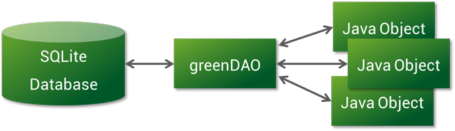
前言 我相信,在平時的開發過程中,大家一定會或多或少地接觸到 SQLite。然而在使用它時,我們往往需要做許多額外的工作,像編寫 SQL 語句與解析查詢結果等。所