編輯:關於Android編程
今天我們封裝一個底部的菜單欄,這個大多數的應用都會用到,因此我們來自定義,方便以後項目的使用。
該控件的實現將分上下篇來介紹,先來看一個菜單欄的子控件–MenuItemM,這個控件有什麼用呢?我們來看下一些主流app上的一些控件,如:

以上三張圖片分別來自微信,今日頭條和去哪兒,接下來我們將看到如何通過一個控件來實現不同的效果。
首先看下我寫的一個deme

可以看到標題欄的消息控件,以及底部三個菜單項都是通過MenuItemM來實現的
這裡面只是演示菜單欄的子控件,我們將在下一篇博客中完成底部菜單欄的封裝,這個控件裡使用了上一篇博客介紹的一個控件ButtonExtendM,可以先看一下http://www.jb51.net/article/103920.htm
接下來看下實現過程
1 定義屬性
<declare-styleable name="MenuItemM">
 <attr name="backColor" />
 <attr name="textColor" />
 <attr name="textColorPress" />
 <attr name="iconDrawable" />
 <attr name="iconDrawablePress" />
 <attr name="text" />
 <attr name="textSize" />
 <attr name="unReadCount" format="integer" />
 <attr name="visibleMore">
  <enum name="visible" value="0x00000000" />
  <enum name="gone" value="0x00000008" />
 </attr>
 <attr name="visibleNew">
  <enum name="visible" value="0x00000000" />
  <enum name="gone" value="0x00000008" />
 </attr>
</declare-styleable>
這裡面重點看一下visibleMore和visibleNew裡面的兩個枚舉值,這裡面與View源碼中的visible和gone保持一致。關於如何定義屬性以及使用,可以參考我之前的博客。
2 布局文件view_menu_item_m.xml
<?xml version="1.0" encoding="utf-8"?>
<FrameLayout xmlns:android="http://schemas.android.com/apk/res/android"
 xmlns:landptf="http://schemas.android.com/apk/res-auto"
 android:layout_width="wrap_content"
 android:layout_height="wrap_content"
 android:layout_gravity="center">

 <com.landptf.view.ButtonExtendM
  android:id="@+id/bem_menu"
  android:layout_width="match_parent"
  android:layout_height="match_parent"
  android:layout_marginRight="8dp"
  landptf: />

 <ImageView
  android:id="@+id/iv_more"
  android:layout_width="wrap_content"
  android:layout_height="wrap_content"
  android:layout_gravity="top|right"
  android:background="@drawable/icon_more"
  android:visibility="gone" />

 <ImageView
  android:id="@+id/iv_new"
  android:layout_width="wrap_content"
  android:layout_height="wrap_content"
  android:layout_gravity="top|right"
  android:background="@drawable/icon_new"
  android:visibility="gone" />

 <com.landptf.view.ButtonM
  android:id="@+id/btm_unread_count"
  android:layout_width="20dp"
  android:layout_height="20dp"
  android:layout_gravity="top|right"
  android:textSize="12sp"
  android:visibility="gone"
  landptf:backColor="#ff0000"
  landptf:fillet="true"
  landptf:shape="oval"
  landptf:textColor="@android:color/white" />

</FrameLayout>
這裡面使用了FrameLayout,主要使用了ButtonExtendM上下結構的控件加上右上角的三種提示信息,數量提示,more提示,new提示
3 MenuItemM.java
package com.landptf.view;

import android.content.Context;
import android.content.res.ColorStateList;
import android.content.res.TypedArray;
import android.graphics.drawable.Drawable;
import android.util.AttributeSet;
import android.util.Log;
import android.view.Gravity;
import android.view.LayoutInflater;
import android.view.MotionEvent;
import android.view.View;
import android.widget.FrameLayout;
import android.widget.ImageView;

import com.landptf.R;

/**
 * Created by landptf on 2016/11/07.
 * 菜單按鈕,例如底部菜單的item或者消息控件
 */
public class MenuItemM extends FrameLayout {

 private static final String TAG = MenuItemM.class.getSimpleName();

 /**
  * 定義控件
  */
 private ButtonExtendM bemMenu;
 private ImageView ivMore;
 private ImageView ivNew;
 private ButtonM btmUnReadCount;

 private OnClickListener onClickListener = null;

 public interface OnClickListener {
  void onClick(View v);
 }

 /**
  * 設置View的Click事件
  *
  * @param l
  */
 public void setOnClickListener(OnClickListener l) {
  this.onClickListener = l;
  //攔截ButtonExtendM控件的點擊事件,使其指向this.onclick
  bemMenu.setOnClickListener(new ButtonExtendM.OnClickListener() {
   @Override
   public void onClick(View v) {
    onClickListener.onClick(v);
   }
  });
 }

 public MenuItemM(Context context) {
  super(context);
 }

 public MenuItemM(Context context, AttributeSet attrs) {
  this(context, attrs, 0);
 }

 public MenuItemM(Context context, AttributeSet attrs, int defStyleAttr) {
  super(context, attrs, defStyleAttr);
  init(context, attrs, defStyleAttr);
 }

 private void init(Context context, AttributeSet attrs, int defStyle) {
  //加載布局
  LayoutInflater.from(context).inflate(R.layout.view_menu_item_m, this, true);
  //初始化控件
  bemMenu = (ButtonExtendM) findViewById(R.id.bem_menu);
  ivMore = (ImageView) findViewById(R.id.iv_more);
  ivNew = (ImageView) findViewById(R.id.iv_new);
  btmUnReadCount = (ButtonM) findViewById(R.id.btm_unread_count);
  btmUnReadCount.setGravity(Gravity.CENTER);
  TypedArray a = getContext().obtainStyledAttributes(
    attrs, R.styleable.MenuItemM, defStyle, 0);
  if (a != null) {
   //設置背景色
   ColorStateList colorList = a.getColorStateList(R.styleable.MenuItemM_backColor);
   if (colorList != null) {
    int backColor = colorList.getColorForState(getDrawableState(), 0);
    if (backColor != 0) {
     setBackColor(backColor);
    }
   }
   //設置icon
   Drawable iconDrawable = a.getDrawable(R.styleable.MenuItemM_iconDrawable);
   if (iconDrawable != null) {
    setIconDrawable(iconDrawable);
   }
   //記錄View被按下時的icon的圖片
   Drawable iconDrawablePress = a.getDrawable(R.styleable.MenuItemM_iconDrawablePress);
   if (iconDrawablePress != null) {
    setIconDrawablePress(iconDrawablePress);
   }
   //設置文字的顏色
   ColorStateList textColorList = a.getColorStateList(R.styleable.MenuItemM_textColor);
   if (textColorList != null) {
    int textColor = textColorList.getColorForState(getDrawableState(), 0);
    if (textColor != 0) {
     setTextColor(textColor);
    }
   }
   //記錄View被按下時文字的顏色
   ColorStateList textColorPressList = a.getColorStateList(R.styleable.MenuItemM_textColorPress);
   if (textColorPressList != null) {
    int textColorPress = textColorPressList.getColorForState(getDrawableState(), 0);
    if (textColorPress != 0) {
     setTextColorPress(textColorPress);
    }
   }
   //設置顯示的文本內容
   String text = a.getString(R.styleable.MenuItemM_text);
   if (text != null) {
    setText(text);
   }
   //設置文本字體大小
   float textSize = a.getFloat(R.styleable.MenuItemM_textSize, 0);
   if (textSize != 0) {
    setTextSize(textSize);
   }
   //設置更多提示是否顯示
   int visibleMore = a.getInt(R.styleable.MenuItemM_visibleMore, -1);
   if (visibleMore != -1){
    setVisibilityMore(visibleMore);
   }
   //設置new提示是否顯示
   int visibleNew = a.getInt(R.styleable.MenuItemM_visibleNew, -1);
   if (visibleNew != -1){
    setVisibilityNew(visibleNew);
   }
   //設置消息未讀數量
   int unReadCount = a.getInt(R.styleable.MenuItemM_unReadCount, -1);
   if (unReadCount != -1){
    setUnReadCount(unReadCount);
   }
   a.recycle();
  }

  setOnClickListener(new View.OnClickListener() {
   @Override
   public void onClick(View v) {
    if (onClickListener != null) {
     onClickListener.onClick(v);
    }
   }
  });
 }

 /**
  * 設置為被選中狀態
  * @param state in MotionEvent.ACTION_DOWN or MotionEvent.ACTION_UP
  */
 public void setPressState(int state){
  if (state != MotionEvent.ACTION_DOWN && state != MotionEvent.ACTION_UP){
   Log.w(TAG, "無效參數");
   return;
  }
  bemMenu.setPressState(state);
 }

 /**
  * 設置View的背景色
  *
  * @param backColor
  */
 public void setBackColor(int backColor) {
  bemMenu.setBackColor(backColor);
 }

 /**
  * 設置icon的圖片
  *
  * @param iconDrawable
  */
 public void setIconDrawable(Drawable iconDrawable) {
  bemMenu.setIconDrawable(iconDrawable);
 }

 /**
  * 設置View被按下時的icon的圖片
  *
  * @param iconDrawablePress
  */
 public void setIconDrawablePress(Drawable iconDrawablePress) {
  bemMenu.setIconDrawablePress(iconDrawablePress);
 }

 /**
  * 設置文字的顏色
  *
  * @param textColor
  */
 public void setTextColor(int textColor) {
  if (textColor == 0) return;
  bemMenu.setTextColor(textColor);
 }

 /**
  * 設置View被按下時文字的顏色
  *
  * @param textColorPress
  */
 public void setTextColorPress(int textColorPress) {
  if (textColorPress == 0) return;
  bemMenu.setTextColorPress(textColorPress);
 }

 /**
  * 設置顯示的文本內容
  *
  * @param text
  */
 public void setText(CharSequence text) {
  bemMenu.setText(text);
 }

 /**
  * 獲取顯示的文本
  *
  * @return
  */
 public String getText() {
  return bemMenu.getText();
 }

 /**
  * 設置文本字體大小
  *
  * @param size
  */
 public void setTextSize(float size) {
  bemMenu.setTextSize(size);
 }

 /**
  * 設置更多提示是否顯示
  * 如果顯示則先重置new和未讀數量圖標
  * @param visibleMore
  */
 public void setVisibilityMore(int visibleMore) {
  if (visibleMore == VISIBLE) {
   resetTip();
  }
  ivMore.setVisibility(visibleMore);
 }

 /**
  * 設置New提示是否顯示
  * 如果顯示則先重置更多和未讀數量圖標
  * @param visibleNew
  */
 public void setVisibilityNew(int visibleNew) {
  if (visibleNew == VISIBLE) {
   resetTip();
  }
  ivNew.setVisibility(visibleNew);
 }

 /**
  * 設置未讀數量
  * 如果小於等於0,表示隱藏
  * 如果大於99,則將其隱藏,同時顯示更多的提示
  * 如果在0-99區間,則隱藏更多和new圖標
  * @param unReadCount
  */
 public void setUnReadCount(int unReadCount){
  if (unReadCount <= 0){
   btmUnReadCount.setVisibility(GONE);
   //如果先設置100(此時會顯示ivMore),再設置0,因此此處應將ivMore同時置為GONE
   if (ivMore.getVisibility() == VISIBLE){
    ivMore.setVisibility(GONE);
   }
   return;
  }
  if (unReadCount > 99){
   setVisibilityMore(VISIBLE);
   return;
  }
  resetTip();
  btmUnReadCount.setVisibility(VISIBLE);
  btmUnReadCount.setText(unReadCount + "");
 }

 /**
  * 重置提示信息
  */
 private void resetTip(){
  setVisibilityMore(GONE);
  setVisibilityNew(GONE);
  setUnReadCount(0);
 }

}
代碼有點長,邏輯比較簡單,本身自定義控件的過程都是類似的,比較多的是對外提供的接口。
特別要注意的是使用時大小要設置為自定義,如果指定了大小或者match_parent,則子控件將居於左上角,無法居中。
4 最後簡單看下如何使用
<com.landptf.view.MenuItemM
 android:id="@+id/mim_home_page"
 android:layout_width="wrap_content"
 android:layout_height="wrap_content"
 android:layout_centerVertical="true"
 android:layout_marginLeft="32dp"
 landptf:iconDrawable="@drawable/icon_home_page"
 landptf:iconDrawablePress="@drawable/icon_home_page_press"
 landptf:textColor="#696969"
 landptf:textColorPress="#303f9f"
 landptf:text="首頁"
 />
這裡面主要使用了以下四個屬性,分別表示默認圖標和按下後顯示的圖標,以及文字顏色和按下後的文字顏色
landptf:iconDrawable="@drawable/icon_home_page"
landptf:iconDrawablePress="@drawable/icon_home_page_press"
landptf:textColor="#696969"
landptf:textColorPress="#303f9f"
final MenuItemM mimHomePage = (MenuItemM) findViewById(R.id.mim_home_page);
if (mimHomePage != null){
 //默認為選中狀態
 mimHomePage.setPressState(MotionEvent.ACTION_DOWN);
 mimHomePage.setVisibilityMore(View.VISIBLE);
 mimHomePage.setOnClickListener(new MenuItemM.OnClickListener() {
  @Override
  public void onClick(View v) {
   //按下後隱藏提示信息
   mimHomePage.setVisibilityMore(View.GONE);
  }
 });
}
好了,就介紹到這裡了,更多的使用方法可以參考源碼MenuItemMTestActivity.java。
全部代碼已托管到開源中國的碼雲上,歡迎下載,地址:https://git.oschina.net/landptf/landptf.git
以上就是本文的全部內容,希望對大家的學習有所幫助,也希望大家多多支持本站。
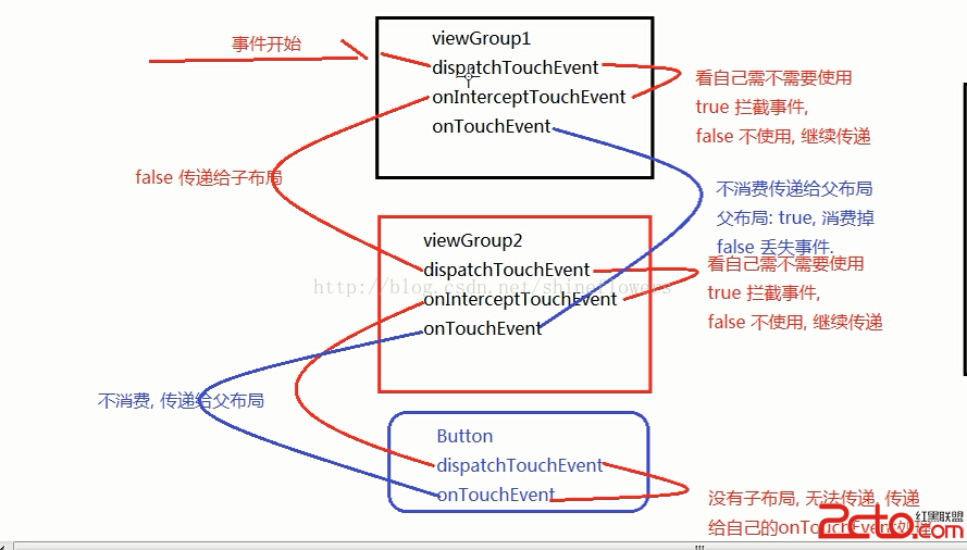 Android 編程下 Touch 事件的分發和消費機制
Android 中與 Touch 事件相關的方法包括:dispatchTouchEvent(MotionEvent ev)、onInterceptTouchEv
 Android Material Design 詳解(使用support v7兼容5.0以下系統)
Material Design是Google在2014年的I/O大會上推出的全新設計語言。Material Design是基於Android 5.0(API level
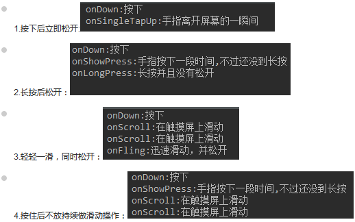 事件處理機制之Gestures(手勢)
(一)概述手勢是:連續觸碰的行為,比如左右上下滑動屏幕,又或者畫一些不規則的幾何圖形! Android對上述兩種手勢行為都提供了支持:Android提供手勢檢測,並為手勢
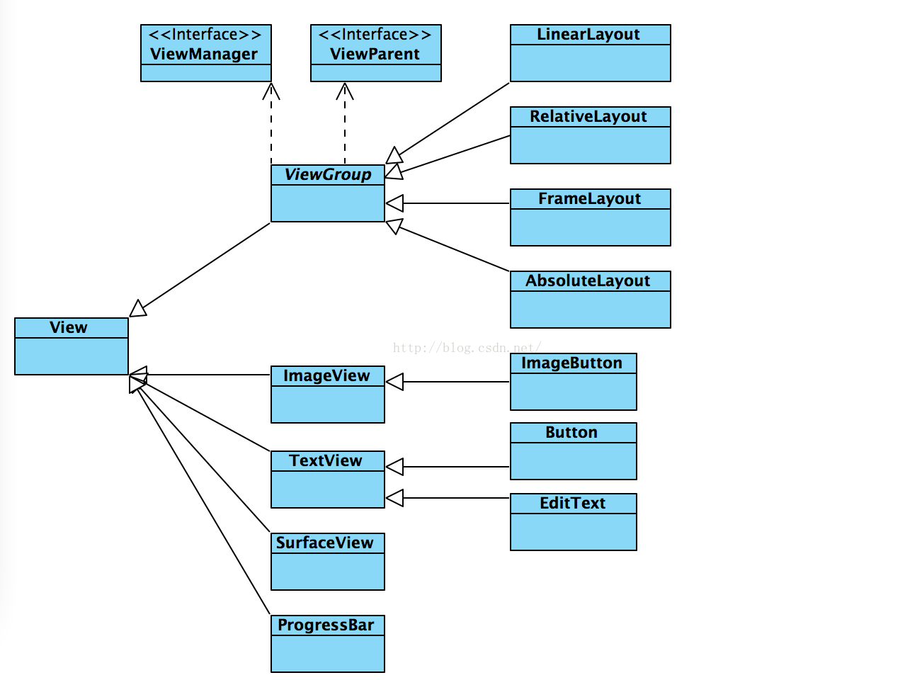 android 自定義控件學習之三 控件布局常用知識總結
1、View是什麼View是Android所有控件的基類,簡單到TextView、Button,復雜到RelativeLayout,LinearLayout,其共同基類都