編輯:關於Android編程
前段時間群裡兄弟項目中有類似這樣的需求
我看到兄弟受苦受難,於心不忍。又因事不關己,打算高高掛起。正在愛恨糾結之時,日神對我說:沒事多造點輪子,你的人生會有很多收獲。這波雞湯讓我深受觸動,於是決定拯救兄弟於水生火熱之中。
重寫onMeasure 決策自身大小
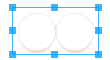
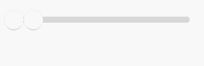
顯而易見當可以拖拽的范圍極限為零時,也就是RangeSeeBar正常顯示能夠接受的極限,粗略一看:Width > 2 * Height
@Override
protected void onMeasure(int widthMeasureSpec, int heightMeasureSpec) {
	int widthSize = MeasureSpec.getSize(widthMeasureSpec);
	int heightSize = MeasureSpec.getSize(heightMeasureSpec);
	if (heightSize * 2 > widthSize) {
		setMeasuredDimension(widthSize, widthSize / 2);
	} else {
		super.onMeasure(widthMeasureSpec, heightMeasureSpec);
	}
}
public class RangeSeekBar extends View {
    private Paint paint = new Paint(Paint.ANTI_ALIAS_FLAG);

    private int lineTop, lineBottom, lineLeft, lineRight;
    private int lineCorners;
    private int lineWidth;
    private RectF line = new RectF();

    public RangeSeekBar(Context context) {
        this(context, null);
    }

    public RangeSeekBar(Context context, AttributeSet attrs) {
        super(context, attrs);
    }

    @Override
    protected void onMeasure(int widthMeasureSpec, int heightMeasureSpec) {
        int widthSize = MeasureSpec.getSize(widthMeasureSpec);
        int heightSize = MeasureSpec.getSize(heightMeasureSpec);
        if (heightSize * 2 > widthSize) {
            setMeasuredDimension(widthSize, (int) (widthSize / 2));
        } else {
            super.onMeasure(widthMeasureSpec, heightMeasureSpec);
        }
    }

    @Override
    protected void onSizeChanged(int w, int h, int oldw, int oldh) {
        super.onSizeChanged(w, h, oldw, oldh);
        int seekBarRadius = h / 2;
        /**
         * 屬性 left right top bottom 描述了SeekBar按鈕的位置
         * 藍後根據它們預先設置確定出 RectF line 背景的三維
         * lineCorners 圓滑的邊緣似乎會比直角更好看
         */
        lineLeft = seekBarRadius;
        lineRight = w - seekBarRadius;
        lineTop = seekBarRadius - seekBarRadius / 4;
        lineBottom = seekBarRadius + seekBarRadius / 4;
        lineWidth = lineRight - lineLeft;
        line.set(lineLeft, lineTop, lineRight, lineBottom);
        lineCorners = (int) ((lineBottom - lineTop) * 0.45f);
    }

    @Override
    protected void onDraw(Canvas canvas) {
        super.onDraw(canvas);
        paint.setStyle(Paint.Style.FILL);
        paint.setColor(0xFFD7D7D7);
        canvas.drawRoundRect(line, lineCorners, lineCorners, paint);
    }
}

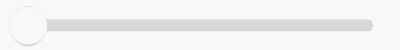
拖動舞台已經備好,SeekBar按鈕半徑也已定好。順水推舟,下一步就繪制SeekBar把。
SeekBar按鈕 擁有對象是極好的
粗略一想:按鈕有顏色、有大小、有變色、被繪制,碰撞檢測、邊界檢測、被拖拽等,最關鍵的是有多個。因此SeekBar按鈕可以說是一個復雜的集合體,是時候來發對象了。
private class SeekBar {
	int widthSize;
	int left, right, top, bottom;
	Bitmap bmp;

	/**
	 * 當RangeSeekBar尺寸發生變化時,SeekBar按鈕尺寸隨之變化
	 *
	 * @param centerX    SeekBar按鈕的X中心在RangeSeekBar中的相對位置
	 * @param centerY    SeekBar按鈕的Y中心在RangeSeekBar中的相對位置
	 * @param heightSize RangeSeekBar期望SeekBar所擁有的高度
	 */
	void onSizeChanged(int centerX, int centerY, int heightSize) {
		/**
		 * 屬性 left right top bottom 描述了SeekBar按鈕的位置

		 * widthSize = heightSize * 0.8f 可見按鈕實際區域是個矩形而非正方形
		 * 圓圈按鈕為什麼要占有矩形區域?因為按鈕陰影效果。不要陰影不行嗎?我就不
		 * 那麼 onMeasure 那邊說好的2倍寬度?我就不
		 */
		widthSize = (int) (heightSize * 0.8f);
		left = centerX - widthSize / 2;
		right = centerX + widthSize / 2;
		top = centerY - heightSize / 2;
		bottom = centerY + heightSize / 2;

		bmp = Bitmap.createBitmap(widthSize, heightSize, Bitmap.Config.ARGB_8888);
		int bmpCenterX = bmp.getWidth() / 2;
		int bmpCenterY = bmp.getHeight() / 2;
		int bmpRadius = (int) (widthSize * 0.5f);
		Canvas defaultCanvas = new Canvas(bmp);
		Paint defaultPaint = new Paint(Paint.ANTI_ALIAS_FLAG);
		// 繪制Shadow
		defaultPaint.setStyle(Paint.Style.FILL);
		int barShadowRadius = (int) (bmpRadius * 0.95f);
		defaultCanvas.save();
		defaultCanvas.translate(0, bmpRadius * 0.25f);
		RadialGradient shadowGradient = new RadialGradient(bmpCenterX, bmpCenterY, barShadowRadius, Color.BLACK, Color.TRANSPARENT, Shader.TileMode.CLAMP);
		defaultPaint.setShader(shadowGradient);
		defaultCanvas.drawCircle(bmpCenterX, bmpCenterY, barShadowRadius, defaultPaint);
		defaultPaint.setShader(null);
		defaultCanvas.restore();
		// 繪制Body
		defaultPaint.setStyle(Paint.Style.FILL);
		defaultPaint.setColor(0xFFFFFFFF);
		defaultCanvas.drawCircle(bmpCenterX, bmpCenterY, bmpRadius, defaultPaint);
		// 繪制Border
		defaultPaint.setStyle(Paint.Style.STROKE);
		defaultPaint.setColor(0xFFD7D7D7);
		defaultCanvas.drawCircle(bmpCenterX, bmpCenterY, bmpRadius, defaultPaint);
	}

	void draw(Canvas canvas) {
        canvas.drawBitmap(bmp, left, top, null);
    }
}
public class RangeSeekBar extends View {

    private SeekBar seekBar = new SeekBar();

    private class SeekBar {
        ...
    }

    @Override
    protected void onSizeChanged(int w, int h, int oldw, int oldh) {
        super.onSizeChanged(w, h, oldw, oldh);
        int seekBarRadius = h / 2;
        ...
		// 在RangeSeekBar確定尺寸時確定SeekBar按鈕尺寸
        seekBar.onSizeChanged(seekBarRadius, seekBarRadius, h);
    }

    @Override
    protected void onDraw(Canvas canvas) {
        super.onDraw(canvas);
        ...
		// 在RangeSeekBar被繪制時繪制SeekBar按鈕
        seekBar.draw(canvas);
    }
}
onTouchEvent 觸摸監聽 讓SeekBar按鈕動起來
@Override
public boolean onTouchEvent(MotionEvent event) {
	switch (event.getAction()) {
		case MotionEvent.ACTION_DOWN:
			boolean touchResult = false;
			// 進行檢測,手指手指是否落在當前SeekBar上。即聲明SeekBar時使用left、top、right、bottom屬性所描述區域的內部
			if (seekbar.collide(event)) {
				touchResult = true;
			}
			return touchResult;
		case MotionEvent.ACTION_MOVE:
			float percent;
			float x = event.getX();
			if (x <= lineLeft) {
				percent = 0;
			} else if (x >= lineRight){
				percent = 1;
			} else {
				percent = (x - lineLeft) * 1f / (lineWidth);
			}
			// SeekBar按鈕根據當前手指在拖動條上的滑動而滑動
			seekbar.slide(percent);
			invalidate();
			break;
	}
	return super.onTouchEvent(event);
}
private class SeekBar {
	int lineWidth; // 拖動條寬度 可在onSizeChanged時刻獲得
	float currPercent;
	int left, right, top, bottom;

	boolean collide(MotionEvent event) {
		float x = event.getX();
		float y = event.getY();
		int offset = (int) (lineWidth * currPercent);
		return x > left + offset && x < right + offset && y > top && y < bottom;
	}

	void slide(float percent) {
		if (percent < 0) percent = 0;
		else if (percent > 1) percent = 1;
		currPercent = percent;
	}

	void draw(Canvas canvas) {
		int offset = (int) (lineWidth * currPercent);
		canvas.save();
		canvas.translate(offset, 0);
		canvas.drawBitmap(bmp, left, top, null);
		canvas.restore();
	}
}
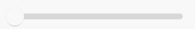
更好的視覺體驗
到目前位置,SeekBar被按壓時顯得死氣沉沉,接下來為其添加強烈的視覺反饋。
那麼之前通過onSizeChanged預設按鈕的偷懶手段就GG了,因為SeekBar的UI效果需要隨觸摸狀態的變化而變化。
首先在onTouchEvent中拿到這個變化
@Override
public boolean onTouchEvent(MotionEvent event) {
	switch (event.getAction()) {
		case MotionEvent.ACTION_MOVE:
			seekBar.material = seekBar.material >= 1 ? 1 : seekBar.material + 0.1f;
			...
			invalidate();
			break;
		case MotionEvent.ACTION_CANCEL:
		case MotionEvent.ACTION_UP:
			seekBar.materialRestore();
			break;
	}
	return super.onTouchEvent(event);
}
private class SeekBar {
	float material = 0;
	ValueAnimator anim;
	final TypeEvaluator te = new TypeEvaluator() {
		@Override
		public Integer evaluate(float fraction, Integer startValue, Integer endValue) {
			int alpha = (int) (Color.alpha(startValue) + fraction * (Color.alpha(endValue) - Color.alpha(startValue)));
			int red = (int) (Color.red(startValue) + fraction * (Color.red(endValue) - Color.red(startValue)));
			int green = (int) (Color.green(startValue) + fraction * (Color.green(endValue) - Color.green(startValue)));
			int blue = (int) (Color.blue(startValue) + fraction * (Color.blue(endValue) - Color.blue(startValue)));
			return Color.argb(alpha, red, green, blue);
		}
	};

	void draw(Canvas canvas) {
		int offset = (int) (lineWidth * currPercent);
		canvas.save();
		canvas.translate(left, 0);
		canvas.translate(offset, 0);
		drawDefault(canvas);
		canvas.restore();
	}

	private void drawDefault(Canvas canvas) {
		int centerX = widthSize / 2;
		int centerY = heightSize / 2;
		int radius = (int) (widthSize * 0.5f);
		// draw shadow
		defaultPaint.setStyle(Paint.Style.FILL);
		canvas.save();
		canvas.translate(0, radius * 0.25f);
		canvas.scale(1 + (0.1f * material), 1 + (0.1f * material), centerX, centerY);
		defaultPaint.setShader(shadowGradient);
		canvas.drawCircle(centerX, centerY, radius, defaultPaint);
		defaultPaint.setShader(null);
		canvas.restore();
		// draw body
		defaultPaint.setStyle(Paint.Style.FILL);
		defaultPaint.setColor(te.evaluate(material, 0xFFFFFFFF, 0xFFE7E7E7));
		canvas.drawCircle(centerX, centerY, radius, defaultPaint);
		// draw border
		defaultPaint.setStyle(Paint.Style.STROKE);
		defaultPaint.setColor(0xFFD7D7D7);
		canvas.drawCircle(centerX, centerY, radius, defaultPaint);
	}

	private void materialRestore() {
		if (anim != null) anim.cancel();
		anim = ValueAnimator.ofFloat(material, 0);
		anim.addUpdateListener(new ValueAnimator.AnimatorUpdateListener() {
			@Override
			public void onAnimationUpdate(ValueAnimator animation) {
				material = (float) animation.getAnimatedValue();
				invalidate();
			}
		});
		anim.addListener(new AnimatorListenerAdapter() {
			@Override
			public void onAnimationEnd(Animator animation) {
				material = 0;
				invalidate();
			}
		});
		anim.start();
	}
}
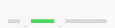
Range
Range的意思就是范圍,但是就算知道這些似乎並沒有什麼卵用 _(:3 」∠)_
so為了了解其中規律,本寶寶使勁摸索。最終發現
如果分開來看它們都擁有自己的固定滑動區間,右邊的SeekBar按鈕就是左邊SeekBar按鈕向右平移了個SeekBar按鈕寬度而已。

public class RangeSeekBar extends View {
    private SeekBar leftSB = new SeekBar();
    private SeekBar rightSB = new SeekBar();
    /**
     * 用來記錄當前用戶觸摸的到底是哪個SB
     */
    private SeekBar currTouch;

    @Override
    protected void onSizeChanged(int w, int h, int oldw, int oldh) {
        super.onSizeChanged(w, h, oldw, oldh);
        ...
        // rightSB就如同分析的一樣,緊緊貼在leftSB的右邊而已
        rightSB.left += leftSB.widthSize;
        rightSB.right += leftSB.widthSize;
    }


    @Override
    protected void onDraw(Canvas canvas) {
        super.onDraw(canvas);
        ...
        leftSB.draw(canvas);
        rightSB.draw(canvas);
    }

    @Override
    public boolean onTouchEvent(MotionEvent event) {
        switch (event.getAction()) {
            case MotionEvent.ACTION_DOWN:
                boolean touchResult = false;
                /**
                 * 為什麼不先檢測leftSB而先檢測rightSB?為什麼? (●'?'●)
                 */
                if (rightSB.collide(event)) {
                    currTouch = rightSB;
                    touchResult = true;
                } else if (leftSB.collide(event)) {
                    currTouch = leftSB;
                    touchResult = true;
                }
                return touchResult;
            case MotionEvent.ACTION_MOVE:
                float percent;
                float x = event.getX();

                if (currTouch == leftSB) {
                    if (x < lineLeft) {
                        percent = 0;
                    } else {
                        percent = (x - lineLeft) * 1f / (lineWidth - rightSB.widthSize);
                    }

                    if (percent > rightSB.currPercent) {
                        percent = rightSB.currPercent;
                    }
                    leftSB.slide(percent);
                } else if (currTouch == rightSB) {
                    if (x > lineRight) {
                        percent = 1;
                    } else {
                        percent = (x - lineLeft - leftSB.widthSize) * 1f / (lineWidth - leftSB.widthSize);
                    }
                    if (percent < leftSB.currPercent) {
                        percent = leftSB.currPercent;
                    }
                    rightSB.slide(percent);
                }

                invalidate();
                break;
        }
        return super.onTouchEvent(event);
    }
}
比如現在2個按鈕直接就保留了一個距離,當然也可以保留n個
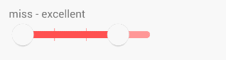
支持刻度模式
當然支持刻度的同時也支持預留范圍
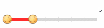
支持自定義UI按鈕樣式背景顏色
似乎少了按壓狀態變化
 Android 自定義View (三) 圓環交替 等待效果
一個朋友今天有這麼個需求(下圖),我覺得那自定義View來做還是很適合的,就做了下,順便和大家分享下,對於自定義View多練沒壞處麼。如果你看了前兩篇,那麼
 Android 源碼系列之(九)從源碼的角度深入理解Activity的launchModel特性
隨著公司新業務的起步由於原有APP_A的包已經很大了,所以上邊要求另外開發一款APP_B,要求是APP_A和APP_B賬號通用且兩個APP可以相互打開。賬號通用也就是說在
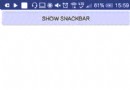 Android進階——Material Design新控件之Snackbar
引言上一篇講解了TabLayout,接下來我們繼續學習Google I/O 2015 推出的 Android Design Support Library的其他成員,這一
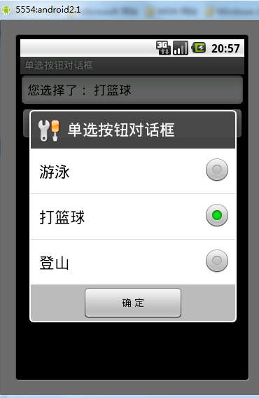 Android單選按鈕對話框用法實例分析
本文實例講述了Android單選按鈕對話框用法。分享給大家供大家參考。具體如下:main.xml布局文件<?xml version=1.0 encoding