編輯:關於Android編程
下面請先看效果圖:

看上去是不很炫的樣子,它的實現上也不是很復雜,重點在與onDraw()方法的繪制。
首先是我們的attrs文件:
<?xml version="1.0" encoding="utf-8"?>
<resources>

 <attr name="firstColor" format="color"/>
 <attr name="secondColor" format="color"/>
 <attr name="circleWidth" format="dimension"/>
 <attr name="speed" format="integer"/>

 <declare-styleable name="CustomView">
  <attr name="firstColor" />
  <attr name="secondColor" />
  <attr name="circleWidth" />
  <attr name="speed" />
 </declare-styleable>

</resources>
接下來是我們重寫View類的自定義View類:
public class MySelfCircleView extends View {

 /*
  * 第一圈顏色
  */
 int firstColor;
 /*
  * 第二圈顏色
  */
 int secondColor;
 /*
  * 圓的寬度
  */
 int circleWidth;
 /*
  * 速率
  */
 int speed;
 /*
  * 畫筆
  */
 Paint mPaint;
 /*
  * 進度
  */
 int mProgress;
 /*
  * 是否切換標志
  */
 boolean isNext;

 public MySelfCircleView(Context context, AttributeSet attrs,
   int defStyleAttr) {
  super(context, attrs, defStyleAttr);
  TypedArray typedArray = context.getTheme().obtainStyledAttributes(attrs, R.styleable.CustomView, defStyleAttr, 0);
  int n = typedArray.getIndexCount();
  for(int i=0; i<n; i++){
   int attr = typedArray.getIndex(i);
   switch (attr) {
    case R.styleable.CustomView_firstColor:
     firstColor = typedArray.getColor(attr, Color.RED);
     break;
    case R.styleable.CustomView_secondColor:
     secondColor = typedArray.getColor(attr, Color.RED);
     break;
    case R.styleable.CustomView_circleWidth:
     circleWidth = typedArray.getDimensionPixelSize(attr, (int) TypedValue.applyDimension(
       TypedValue.COMPLEX_UNIT_PX, 20, getResources().getDisplayMetrics()));
     break;
    case R.styleable.CustomView_speed:
     speed = typedArray.getInt(attr, 20);
     break;
   }
  }
  typedArray.recycle();

  mPaint = new Paint();
  new Thread(new Runnable() {
   @Override
   public void run() {
    while (true) {
     mProgress++;
     if (mProgress == 360) {
      mProgress = 0;
      if (!isNext)
       isNext = true;
      else
       isNext = false;
     }
     postInvalidate();
     try {
      Thread.sleep(speed);
     } catch (InterruptedException e) {
      e.printStackTrace();
     }
    }
   }
  }).start();
 }

 public MySelfCircleView(Context context, AttributeSet attrs) {
  this(context, attrs, 0);
 }

 public MySelfCircleView(Context context) {
  this(context, null);
 }

 @Override
 protected void onDraw(Canvas canvas) {
  super.onDraw(canvas);
  int centre = getWidth() / 2; // 獲取圓心的x坐標
  int radius = centre - circleWidth / 2;// 半徑
  mPaint.setStrokeWidth(circleWidth); // 設置圓環的寬度
  mPaint.setAntiAlias(true); // 消除鋸齒
  mPaint.setStyle(Paint.Style.STROKE); // 設置空心
  RectF oval = new RectF(centre - radius, centre - radius, centre + radius, centre + radius); // 用於定義的圓弧的形狀和大小的界限
  if (!isNext) {// 第一顏色的圈完整,第二顏色跑
   mPaint.setColor(firstColor); // 設置圓環的顏色
   canvas.drawCircle(centre, centre, radius, mPaint); // 畫出圓環
   mPaint.setColor(secondColor); // 設置圓環的顏色
   canvas.drawArc(oval, -90, mProgress, false, mPaint); // 根據進度畫圓弧
  } else {
   mPaint.setColor(secondColor); // 設置圓環的顏色
   canvas.drawCircle(centre, centre, radius, mPaint); // 畫出圓環
   mPaint.setColor(firstColor); // 設置圓環的顏色
   canvas.drawArc(oval, -90, mProgress, false, mPaint); // 根據進度畫圓弧
  }
 }

}
最後是我們的布局文件:
<RelativeLayout xmlns:android="http://schemas.android.com/apk/res/android"
 xmlns:zhy="http://schemas.android.com/apk/res/com.example.myselfview"
 android:layout_width="match_parent"
 android:layout_height="match_parent" >

 <com.example.myselfview.view.MySelfCircleView
  android:layout_width="120dp"
  android:layout_height="120dp"
  android:layout_marginTop="20dp"
  android:layout_alignParentTop="true"
  android:layout_centerHorizontal="true"
  zhy:circleWidth="15dp"
  zhy:firstColor="#D4F668"
  zhy:secondColor="#2F9DD2"
  zhy:speed="10" />

 <com.example.myselfview.view.MySelfCircleView
  android:layout_width="200dp"
  android:layout_height="200dp"
  android:layout_alignParentBottom="true"
  android:layout_centerHorizontal="true"
  zhy:circleWidth="24dp"
  android:layout_marginBottom="40dp"
  zhy:firstColor="#16A3FA"
  zhy:secondColor="#D20F02"
  zhy:speed="5" />

</RelativeLayout>
總結
好了,到這裡我們的效果就算大工告成,感興趣的朋友可以寫寫看,個人感覺自定義View需要大量的練習,才能為我所用。希望本文對大家開發Android能有所幫助。
 Android5.0+ CollapsingToolbarLayout使用詳解
CollapsingToolbarLayout作用是提供了一個可以折疊的Toolbar,它繼承至FrameLayout,給它設置layout_scrollFlags,它可
 Android研究之游戲開發主角與地圖的滾動
人物移動地圖的平滑滾動處理 玩過rpg游戲的朋友應該都知道RPG的游戲地圖一般都比較大 今天我和大家分享一下在RPG游戲
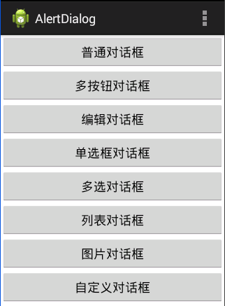 Android:對話框(警告對話框&進度條對話框&日期對話框&時間對話框)
對話框以下四種:AlertDialog:警告對話框。ProgressDialog:進度條對話框。DatePickerDialog:日期對話框。TimePickerDial
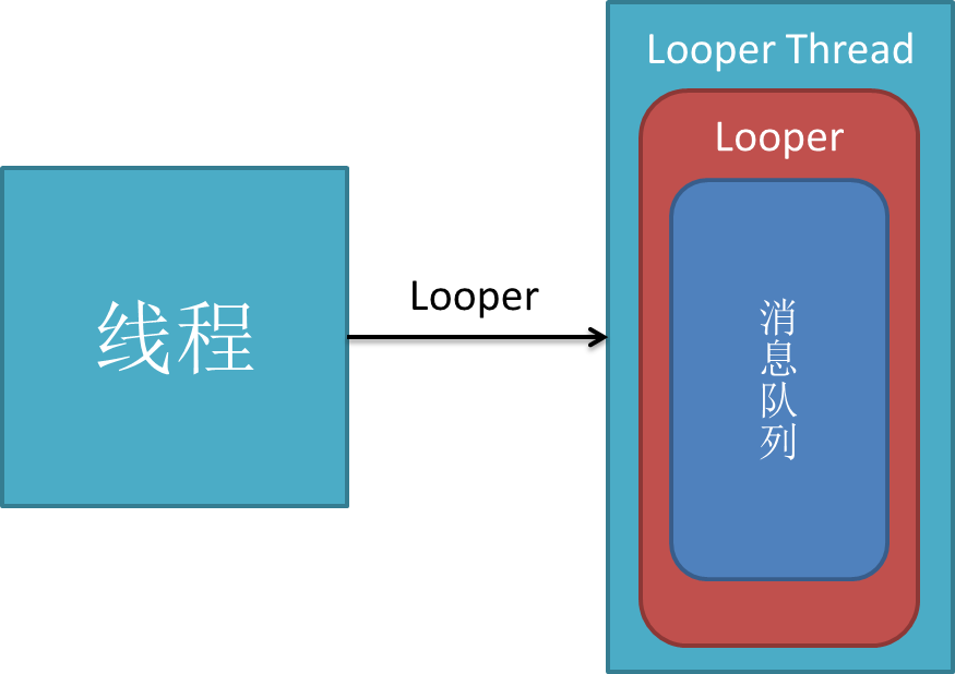 Android消息處理機制:Looper,MessageQueue,Handler
C++ LooperLooperLooper類[system/core/libutils/Looper.cpp]提供了pollOnce(),wake()函數來完成睡眠等待